The Matterhorn in 3D
I’ve wanted to post a Matplotlib 3D visualization for a while, but sharing it on the web is difficult. It’s easy to save 2D plots and embed them on this page. For a 3D plot, it works better when you can do plt.show() and explore it through the figure window.
I think I found a good subject and a satisfying way to present it. The plan is to do plt.savefig() like usual, and then create an animation that rotates 360° around the plot.
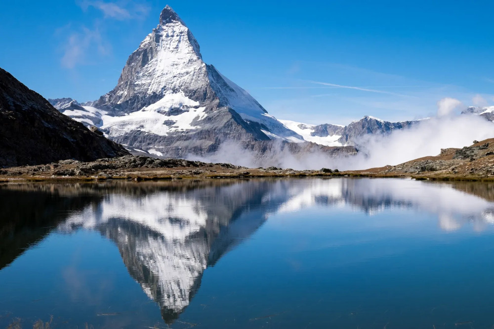
The Matterhorn is a famous mountain peak in the Alps, just north of the Swiss-Italian border. Its summit rests at 14,692 feet above sea level. That makes it only the 12th-tallest mountain in the Alps, but its four steep faces that tower over the surrounding area make it one of the most recognizable in the world.
The Swiss Federal Office of Topography provides an extremely precise digital elevation model (DEM) of their whole country. I think visualizing the Matterhorn is a perfect way to jump into 3D data with Matplotlib.
1. Download the data.
You can access swissALTI3D DEM data here.
They provide the DEM in a couple different formats. I like the idea of working with bare-bones XYZ files. With these files, you get a bunch of three-dimensional (x, y, z) coordinates, hopefully in a nice rectangular pattern, written in plain text like a CSV file. Here’s a sample of the data:
X Y Z
2615001 1090999 3495.52
2615003 1090999 3495.18
2615005 1090999 3494.36
Z represents elevation above sea level (meters). X and Y are reported in Switzerland’s LV95 coordinate system (also in meters). You could convert the data to a more recognizable latitude-longitude system but it doesn’t seem necessary.
The DEM divides Switzerland into a grid of 1 km² sections. I’ve located the Matterhorn and selected a 3×3 square around the peak. swissALTI3D provides a text file containing URLs for each section’s data. I’ll link that file at the bottom of this post.
Downloading nine files manually isn’t that difficult but I would still rather use Python. It will make it easy to grab hundreds of files for a future map.
The project’s folder structure is shown below. We have two subfolders: one for downloaded ZIP files and another for XYZ files after they’ve been decompressed.
project_folder/
├── main.py
├── zip_files/
└── xyz_files/
Use requests and zipfile to grab the data. Append file paths to a list so we can reference them later.
import requests
from zipfile import ZipFile
from os import listdir
import pandas as pd

file_path_list = []

df = pd.read_csv("ch.swisstopo.swissalti3d-7Nq9hXI9.csv", names=["url"])

for r, row in df.iterrows():
    response = requests.get(row['url'], stream=True)
    with open(f"zip_files/{r}.zip", "wb") as f:
        for chunk in response.iter_content(chunk_size=8192):
            f.write(chunk)

    with ZipFile(f"zip_files/{r}.zip", 'r') as z:
        z.extractall(f"xyz_files/{r}")

    file_path_list.append(f"xyz_files/{r}/{listdir(f'xyz_files/{r}')[0]}")
2. Prepare the data.
I’m most comfortable with pandas but you could just as easily read the data with NumPy. It will be converted into NumPy arrays anyway so that approach would make sense.
Load the nine XYZ files into individual pandas DataFrames and append them to a list. Then call pd.concat to stack them into one large DataFrame.
df_list = []

for file in file_path_list:
    df_list.append(pd.read_csv(file, delimiter=" "))

df = pd.concat(df_list)
This is optional but I want to convert the Z column (elevation) from meters to feet. Multiply the column by a conversion factor (≈3.28).
df['Z'] = df['Z'] * 3.28084
df.head() looks like this:
         X        Y             Z
0  2615001  1090999  11468.241837
1  2615003  1090999  11467.126351
2  2615005  1090999  11464.436062
3  2615007  1090999  11454.527926
4  2615009  1090999  11446.817952
We’re looking at a small plot of terrain about 3,000 feet below Matterhorn’s peak.
Notice that X increments by 2. Each 1 km square is further divided into a 500×500 grid of 2-meter squares. Every row of the DataFrame represents one of those squares. Matplotlib will plot the locations in 3D space to visualize the mountain.
If you do the math, each 1 km square has 500*500=250,000 points. We stacked nine of them together so df has 2.25 million rows. That’s easily the largest dataset I’ve worked with on the blog. It’s only ~60 MB so memory shouldn’t be an issue, but it might take your PC a couple minutes to run the script.
A lot of people say, “Why bother, I can just use Excel.” This is a good example of when you definitely can’t do the same thing in Excel.
Now we have to convert the data into something Matplotlib can understand.
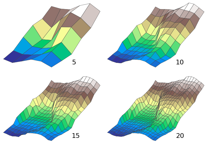
It wouldn’t make sense to plot all 2.25 million points on a small 1000-pixel image. It would take significantly longer to process and we simply don’t have enough screen resolution to see it.
Instead we’ll decide on a lower number of divisions—maybe 200—and divide the XY area into a grid of larger squares. Then we’ll use scipy.interpolate.griddata to calculate Z values for the new grid map.
np.linspace creates an evenly spaced array ranging from minimum to maximum values. np.meshgrid is something I’ve written about in greater detail before. It essentially reshapes a pair of 1D arrays into a pair of 2D arrays with corresponding points. You can think of them like a map of all the grid points.
To visualize terrain, we combine them with another 2D array that holds elevation data, which is where griddata comes in. This method accepts the original (x, y, z) data and the new grid arrays.
import numpy as np
from scipy.interpolate import griddata

x = df['X']
y = df['Y']
z = df['Z']

x_grid = np.linspace(x.min(), x.max(), 200)
y_grid = np.linspace(y.min(), y.max(), 200)
x_grid, y_grid = np.meshgrid(x_grid, y_grid)

z_elevation = griddata((x, y), z, (x_grid, y_grid), method="cubic")
You’ll notice diminishing returns after 200 divisions. Even this plot won’t look significantly better than 100 but we can err on the high side.
Here’s a diagram that shows a 1 km² chunk of Switzerland at various resolutions. You can spot finer features with higher resolution, but obviously there’s a tradeoff with CPU time.
You might think, “If I set the argument in linspace() to 500, that would be like using all the data in the XYZ file. Why wouldn’t I just generate the Z array myself?”
You could do that. But you’d probably end up writing a nested for loop that’s significantly slower than scipy.interpolate.griddata. If you’re a wizard then feel free. I know when I’m outmatched so I’ll happily rely on SciPy.
3. Plot the data.
I’ll stick with default Matplotlib and skip creating a custom mplstyle. I want to write the simplest possible example (within reason) to help someone get started with 3D data.
Instantiating a 3D Axes is a little more awkward than 2D. It’s best to first create a Figure and then create an Axes. “111” is a quick way of saying, “1 row, 1 column, 1st position.” Use subplots_adjust to specify the plot’s outer margins. Units are relative to the entire figure (0.0 to 1.0).
import matplotlib.pyplot as plt

fig = plt.figure(figsize=(10, 8.4))
ax = fig.add_subplot(111, projection="3d")
fig.subplots_adjust(left=0.04, right=0.99, bottom=0.01, top=0.99)
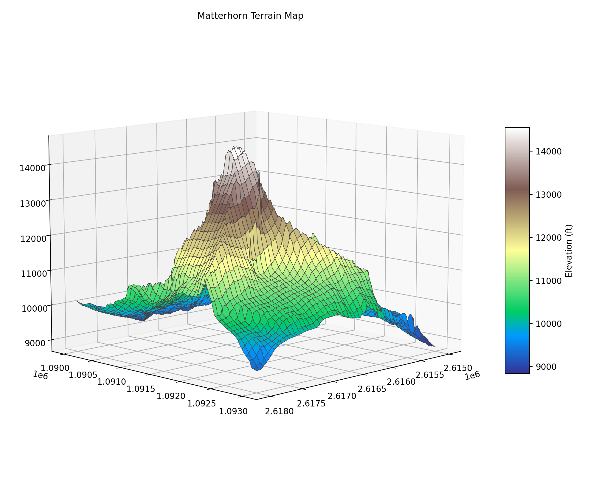
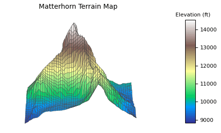
The important business happens in plot_surface. Here we pass the three 2D NumPy arrays we just created.
cmap refers to color map, which will automatically color the surface according to Z value. In this application Z represents elevation, so we’ll see a gradient from the base of Matterhorn to its peak. linewidth and edgecolor give the surface a sort of wire frame that makes it easier to see when rendered on screen. You could omit them but I think they improve the visualization.
surface = ax.plot_surface(x_grid, y_grid, z_elevation, cmap="terrain", linewidth=0.5, edgecolor="#444")
Let’s also create a colorbar, which is like a legend for Z values. It tells us exactly what elevation is represented by a given color. By default colorbar steals part of its parent’s Axes, so it will slide in to the surface’s right.
shrink is the color bar’s size relative to its Axes. 0.5 means it will be half the overall Axes height. aspect defines height-width ratio, so this color bar will be tall and skinny. There’s no way to set a color bar title directly but we can call a method on the instance after it’s created.
color_bar = fig.colorbar(surface, shrink=0.5, aspect=10)
color_bar.set_label("Elevation (ft)")
Set a title for the plot as well.
ax.set_title("Matterhorn Terrain Map", size=11)
view_init positions the camera. It wouldn’t be necessary if we were calling plt.show(). Once the figure window appeared you could click and drag the camera wherever you wanted. But it’s very important to locate the camera when producing a static PNG image. We only get one look at the surface.
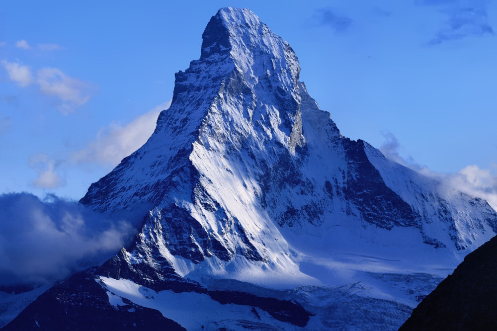
elev (elevation) moves the camera up and down. azim (azimuth) rotates it like the moon rotates around the Earth. The chosen values get close to matching the Matterhorn picture on its Wikipedia page (shown below).
ax.view_init(elev=10, azim=45)
Finally, save the figure. It might take a minute or two for the script to run, depending on your internet and CPU speeds.
plt.savefig("matterhorn.png", dpi=200)
4. The output.
This shows a 3 km x 3 km area surrounding the Matterhorn. It isn’t the highest peak in the world but it’s arguably the most striking. You can see why it’s so famous.
Real life for comparison:
There’s a lot of empty white space in the output image. It’s there because when you do plt.show and move the camera around, axis labels need a lot of space. There’s only so much you can do about it natively in Matplotlib. If it bothers you (like it does me), one solution is to use OpenCV to crop out white space.
That’s what I did to create this GIF:
I love how the animation turned out. Mountains are so big that it’s tough to get a good look around them. The code is essentially the same as above except it generates 180 images while incrementing the azimuth two degrees each frame.
I like this script because it takes the most basic possible three-dimensional spatial data—(x, y, z) coordinates in a CSV file—and outputs a nice visualization. You don’t need a proprietary database format and a whole software package to work with it. Even in 3D, you can get the job done with open-source software.
Full code:
import requests
from zipfile import ZipFile
from os import listdir
import pandas as pd
import numpy as np
from scipy.interpolate import griddata
import matplotlib.pyplot as plt


file_path_list = []

df = pd.read_csv("ch.swisstopo.swissalti3d-7Nq9hXI9.csv", names=["url"])

for r, row in df.iterrows():
    response = requests.get(row['url'], stream=True)
    with open(f"zip_files/{r}.zip", "wb") as f:
        for chunk in response.iter_content(chunk_size=8192):
            f.write(chunk)

    with ZipFile(f"zip_files/{r}.zip", 'r') as z:
        z.extractall(f"xyz_files/{r}")

    file_path_list.append(f"xyz_files/{r}/{listdir(f'xyz_files/{r}')[0]}")

df_list = []

for file in file_path_list:
    df_list.append(pd.read_csv(file, delimiter=" "))

df = pd.concat(df_list)

df['Z'] = df['Z'] * 3.28084

x = df['X']
y = df['Y']
z = df['Z']

x_grid = np.linspace(x.min(), x.max(), 200)
y_grid = np.linspace(y.min(), y.max(), 200)
x_grid, y_grid = np.meshgrid(x_grid, y_grid)

z_elevation = griddata((x, y), z, (x_grid, y_grid), method="cubic")

fig = plt.figure(figsize=(10, 8.4))
ax = fig.add_subplot(111, projection="3d")
fig.subplots_adjust(left=0.04, right=0.99, bottom=0.01, top=0.99)

surface = ax.plot_surface(x_grid, y_grid, z_elevation, cmap="terrain", linewidth=0.5, edgecolor="#444")

color_bar = fig.colorbar(surface, shrink=0.5, aspect=10)
color_bar.set_label("Elevation (ft)")

ax.set_title("Matterhorn Terrain Map", size=11)

ax.view_init(elev=10, azim=45)

plt.savefig("matterhorn.png", dpi=200)