
The aging US population
It’s difficult to overstate how the United States has aged in recent decades. We have fewer kids, longer lifespans, and better medical care than ever.
Those things aren’t bad per se, but they do present challenges for a program like Social Security, which relies on younger people paying into the system while older people draw benefits. It becomes increasingly difficult to stay afloat as the balance tips from young to old.
Our society’s composition is dramatically different than when FDR signed the program into law in 1935. We should think about how to account for these changes when planning for the future.

1. The code.
First, let’s take a look at census data and get a feel for the American population.
Pulling 125-year-old data from the US Census Bureau is its own challenge. I’ve gone ahead and combined all the annual datasets into one standardized CSV file. If you’d like to play around with the data yourself, check out the Census Bureau’s data archive here.
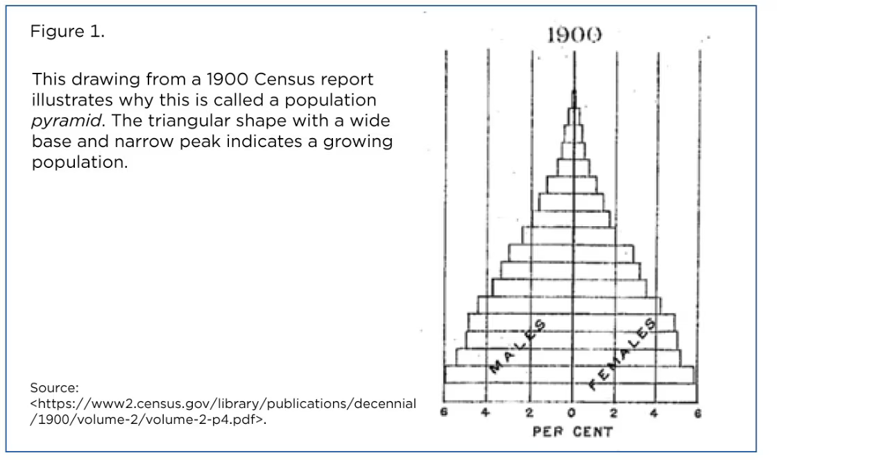
The plan is to create an age pyramid of the US population. This type of plot presents male and female age distributions as a double-sided horizontal bar chart. Because there are generally more young people than old, bars roughly form a pyramid shape. Hence the name.
For this post we’ll add a time dimension by turning the pyramid into an animated GIF. Every year from 1900 to 2019 will be its own frame (it’s better to stop short of 2020 because COVID-19 threw a wrench into data collection). The output will visualize age distribution and how it’s changed over time.
Begin by reading the CSV into a pandas DataFrame. Name it df_all because we’ll copy and filter it many times.
import pandas as pd

df_all = pd.read_csv("census_age_1900-2019.csv")
df.head() looks like this:
   year    age     male   female     both     total
0  1900    0-4  4639000  4542000  9181000  76094000
1  1900    5-9  4483000  4397000  8880000  76094000
2  1900  10-14  4086000  4000000  8086000  76094000
3  1900  15-19  3757000  3811000  7568000  76094000
4  1900  20-24  3653000  3730000  7383000  76094000
You can see that I’ve grouped ages into five-year bins. We have coverage for ages up to 70-74 for all census years. Beginning in 1980, we have 75-79 and 80-84 bins as well. It’s not a problem. Those bars will pop up about halfway through the animation.
I’ll use a custom Matplotlib style that will be linked at the bottom of this post.
The bulk of the code will be nested inside a large for loop. Each iteration of the loop will process one year, or one frame of the GIF.
We’ll use the DataFrame’s index as a vertical axis. Reset the index so that every frame is identical.
import matplotlib.pyplot as plt

plt.style.use("wollen_age_pyramid.mplstyle")

for year in range(1900, 2020):
    df = df_all.copy()

    df = df[df['year'] == year].reset_index(drop=True)

    [...]
Our age pyramid will be slightly different than the figure above. It will convert age group counts to percentages of the total population. Since the overall US population has quadrupled since 1900, it’s a good idea to normalize the age distribution, i.e. make the bars add up to 100%.
for year in range(1900, 2020):

    [...]

    df['male_pct'] = df['male'] / df['total'] * 100

    df['female_pct'] = df['female'] / df['total'] * 100

    [...]
I’d like the animation to have a “progress bar” near the top of the figure. Rather than printing a year on every frame, which would be difficult to read, we can have a bar that goes from 1900 to 2019.
Create two Axes in a vertical (2, 1) layout. height_ratios makes for easy scaling. The upper progress bar Axes will be 1/30th the size of the lower pyramid Axes.
for year in range(1900, 2020):

    [...]

    fig, (ax0, ax1) = plt.subplots(2, 1, height_ratios=(1, 30))

    [...]
We can use Matplotlib’s horizontal bar chart method, barh.
Male bars extend leftward so we have to multiply them by -1. The vertical axis is categorical with age ranges. Pass df.index and later we’ll replace vertical ticks with custom strings.
for year in range(1900, 2020):

    [...]

    ax1.barh(df.index, df['male_pct'] * -1)

    ax1.barh(df.index, df['female_pct'])

    [...]
Let’s also plot a dark gray vertical line at 0 to serve as a boundary between male and female bars.
Set ticks and window limits. The vertical axis, df.index, ranges from 0 to 16. Set integer ticks and then replace their labels with custom strings, e.g. “25-29”.
barh is a little odd because it accepts the vertical axis first, but Matplotlib still follows the normal convention of horizontal x-ticks and vertical y-ticks.
for year in range(1900, 2020):

    [...]

    ax1.plot([0, 0], [-100, 100], color="#555")

    ax1.set(xticks=range(-7, 8),
            xticklabels=[f"{abs(n)}%" if n != 0 else "—" for n in range(-7, 8)],
            xlim=(-7.5, 7.5),
            yticks=range(17),
            yticklabels=[f"{n}-{n + 4}" for n in range(0, 85, 5)],
            ylim=(-0.8, 17))

    [...]
Use text to label “Male” and “Female” near the top of the window. A bbox dictionary creates background for text. These background colors match the bars themselves.
for year in range(1900, 2020):

    [...]

    ax1.text(x=-0.1,
             y=16.8,
             s="Male",
             ha="right",
             va="center",
             bbox={"boxstyle": "Round", "facecolor": "#B5D63D", "edgecolor": "None", "alpha": 0.35, "pad": 0.1})

    ax1.text(x=0.1,
             y=16.8,
             s="Female",
             ha="left",
             va="center",
             bbox={"boxstyle": "Round", "facecolor": "#7A30AB", "edgecolor": "None", "alpha": 0.35, "pad": 0.1})

    [...]
The progress bar on ax0 is simpler than it sounds. Just plot a red line spanning 1900 to the current year. It will appear to travel from left to right as the animation plays.
Specify ticks and window limits to scale the line appropriately.
We can’t use ax0.set_axis_off() because it would hide x-ticks, but we can make grid lines invisible by setting grid to False.
for year in range(1900, 2020):

    [...]

    ax0.plot([1900, year], [0, 0], color="#D00", marker="o", markersize=4)

    ax0.set(xticks=range(1900, 2030, 10),
            xlim=(1899, 2023),
            yticks=[],
            ylim=(-10, 10),
            title="US Age Pyramid  •  1900–2019")

    ax0.grid(False)

    [...]
Finally, save the figure and close it, which prevents Matplotlib from holding every frame in memory.
for year in range(1900, 2020):

    [...]

    plt.savefig(f"frames/{year}.png")

    plt.close()
The script will generate 120 frames in a “frames” folder. You can then use a program like GIMP to create an animated GIF.
2. The output.
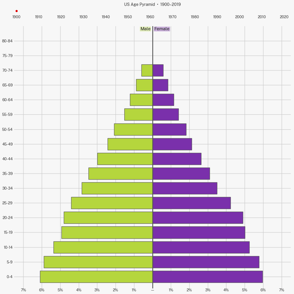
We’ve gone from an age pyramid to an age cylinder! In 1900 you were 6x more likely to run into a 5-year-old than a 65-year-old. Today, the chances are roughly equal.
It’s important to remember that these are age distributions. We have percentages on the x-axis, not absolute numbers of people. The country today has a greater number of kids but they’re a smaller share of the overall population.
You can see the post-WWII baby boom ripple up the pyramid. But when that generation grew up, they had fewer kids of their own.
Shifting demographics have lurked behind countless 20th century social changes—many of which we hardly notice—from positions of leadership to family dynamics to pop culture. But I especially want to highlight the trouble for social insurance programs. Working-age people who pay into the system are a smaller slice of the population, while the share of retired people is proportionally larger. Even without expanding benefits you would expect Social Security and Medicare obligations to grow. And these programs account for more than one-third of the overall federal budget (!).
Low birth rates are common issue across the developed world. In fact many European and East Asian countries are struggling even more than the United States. That’s not surprising as it’s natural for birth rates to fall as education and income levels rise. Higher incomes raise the opportunity cost of having children.
It’s unlikely that we’ll return to having as many kids as our great-grandparents did, but we can craft forward-looking policy to address modern problems. Of course I don’t want to get rid of old people, so to improve the demographic balance we’ll need more young people.
How can we work toward that goal? We can start with two obvious measures: (1) using incentives to nudge people toward children, and (2) sharply increasing high-skill immigration.
Raising kids is expensive! Subsidies like the Child Tax Credit (CTC) make life a little easier for parents who are considering another child. And in this case there are obvious—arguably more important—social benefits. When we expanded the CTC in 2021 as part of the American Rescue Plan we saw a significant reduction in childhood hunger.
Expanding immigration is another way to grow the base of the pyramid. We forego enormous economic potential by overly restricting high-skilled individuals from working here. Immigrants don’t only grow the economy. They pay taxes as well.
Addressing demographic challenges will require long-term strategic thinking from the federal government, which unfortunately is in short supply these days. You might feel that pro-natal incentives are expensive, or that they don’t apply to you, or that immigrants undermine some ahistorical idea of American culture. But a stagnating American economy with a shrinking tax base hurts everyone, including non-Americans.
The first step is to understand. I hope this post can demonstrate the scale of the challenge.
Full code:
import pandas as pd
import matplotlib.pyplot as plt


df_all = pd.read_csv("census_age_1900-2019.csv")

plt.style.use("wollen_age_pyramid.mplstyle")

for year in range(1900, 2020):
    df = df_all.copy()

    df = df[df['year'] == year].reset_index(drop=True)

    df['male_pct'] = df['male'] / df['total'] * 100

    df['female_pct'] = df['female'] / df['total'] * 100

    fig, (ax0, ax1) = plt.subplots(2, 1, height_ratios=(1, 30))

    ax1.barh(df.index, df['male_pct'] * -1)

    ax1.barh(df.index, df['female_pct'])

    ax1.plot([0, 0], [-100, 100], color="#555")

    ax1.set(xticks=range(-7, 8),
            xticklabels=[f"{abs(n)}%" if n != 0 else "—" for n in range(-7, 8)],
            xlim=(-7.5, 7.5),
            yticks=range(17),
            yticklabels=[f"{n}-{n + 4}" for n in range(0, 85, 5)],
            ylim=(-0.8, 17))

    ax1.text(x=-0.1,
             y=16.8,
             s="Male",
             ha="right",
             va="center",
             bbox={"boxstyle": "Round", "facecolor": "#B5D63D", "edgecolor": "None", "alpha": 0.35, "pad": 0.1})

    ax1.text(x=0.1,
             y=16.8,
             s="Female",
             ha="left",
             va="center",
             bbox={"boxstyle": "Round", "facecolor": "#7A30AB", "edgecolor": "None", "alpha": 0.35, "pad": 0.1})

    ax0.plot([1900, year], [0, 0], color="#D00", marker="o", markersize=4)

    ax0.set(xticks=range(1900, 2030, 10),
            xlim=(1899, 2023),
            yticks=[],
            ylim=(-10, 10),
            title="US Age Pyramid  •  1900–2019")

    ax0.grid(False)

    plt.savefig(f"frames/{year}.png")

    plt.close()