
Is Scottie Scheffler the new Tiger Woods?
Scottie Scheffler has been ranked #1 on the PGA Tour for over three years now. In 2025 he won six tournaments, including two major championships. At this point hardly anyone disputes that Scheffler is the best golfer in the world. But how do his results compare to other great runs of the past 25 years?
On the PGA Tour players get to choose which tournaments they enter. Most aren’t present at every event. What we can do is calculate a rolling win rate and see how often each player won the tournaments they entered. For example, if someone entered 10 tournaments during a given time frame—we’ll say two years—and won four of them, that would represent a 40% win rate. We’ll calculate this rolling win rate for all golfers on tour and see how Scottie compares.
1. The data.
Grab this PGA results dataset from Kaggle. It goes back to 2001 so it misses Tiger Woods’ late-90s heyday, but he was still on top of the world until 2010 or so. Tiger will provide a good baseline. The dataset also excludes tournaments with alternate scoring formats. Most of those are team events like the Ryder Cup that I would want to drop anyway, so that’s fine.
Start by creating a Matplotlib Axes instance for plotting. I’ll use a custom mplstyle that will be linked at the bottom of this post.
import pandas as pd
import matplotlib.pyplot as plt

plt.style.use("wollen_pga.mplstyle")

fig, ax = plt.subplots()
Load the dataset into a pandas DataFrame. Set the index as the tournament start date column so pandas’ rolling method will know where to look.
df_all = pd.read_csv("pga_results_2001-2025.tsv",
                     delimiter="\t",
                     parse_dates=["start"],
                     index_col="start")
Create a boolean win column. In pandas, calling mean() on a Series of bools returns the percentage of TRUE values. We’ll filter the DataFrame down to each player’s results and use this column to see how often they won.
df_all['win'] = df_all['position'] == "1"
By channeling TV cooking show magic I can tell you ahead of time that the winningest golfers during this period were Tiger Woods, Vijay Singh, and Scottie Scheffler. They all produced rolling win rates exceeding 20%. We’ll iterate through these three names, calculate their win rates, and plot their careers one after another.
For each view of the DataFrame, create a win_rate column using the rolling method. We specify the window to be 730 days, i.e. two years, and require a minimum of 20 tournaments inside the window to generate a value. Since it’s operating on a bool column, mean tells us how many values are TRUE. Multiply by 100 to convert to a percentage.
Then plot this win_rate column on the Axes. Recall that the DataFrame’s index is tournament start date. We’re plotting a time series.
for name in ["Tiger Woods", "Vijay Singh", "Scottie Scheffler"]:
    df = df_all.copy()

    df = df[df['name'] == name]

    df['win_rate'] = df['win'].rolling("730D", min_periods=20).mean() * 100

    ax.plot(df.index, df['win_rate'], label=name)
Make y-ticks a list of percentage values.
y_ticks = range(0, 70, 10)
ax.set(yticks=y_ticks,
       yticklabels=[f"{tick}%" for tick in y_ticks],
       ylim=(-1, y_ticks[-1] * 1.005))
Pandas’ date_range is a convenient way to get a list of evenly spaced timestamps. A frequency of “2YS” requests one value every two years (Y) at the start (S) of the year, i.e. January 1st. These will be our x-ticks.
x_ticks = pd.date_range(start="January 1 2002", end="January 1 2026", freq="2YS")
x_tick_range = (x_ticks[-1] - x_ticks[0]).days
x_margin = pd.Timedelta(f"{x_tick_range * 0.02} days")
x_left, x_right = x_ticks[0] - x_margin, x_ticks[-1] + x_margin
ax.set(xticks=x_ticks,
       xticklabels=[tick.strftime("%Y") for tick in x_ticks],
       xlim=(x_left, x_right))
When a plot requires more than a few words of explanation, I find it’s best to use a title plus a subtitle. Draw these in the upper-left corner with text, which allows for different fonts between the main heading and its subtitle. A weight of 400 will be slightly bolder than default.
ax.text(x=x_left + pd.Timedelta(f"{x_tick_range * 0.01} days"),
        y=y_ticks[-1] * 1.045,
        s="PGA Tour  •  Win Rate During Previous 2 Years",
        weight=400)

ax.text(x=x_left + pd.Timedelta(f"{x_tick_range * 0.01} days"),
        y=y_ticks[-1] * 1.015,
        s="Minimum 20 Tournaments in Window  •  Max Win Rate > 20%  •  Data: ESPN")
Finally, add a legend in the upper-right corner and save the Figure.
ax.legend(loc="upper right")

plt.savefig("pga_win_rate.png", dpi=200)
2. The output.
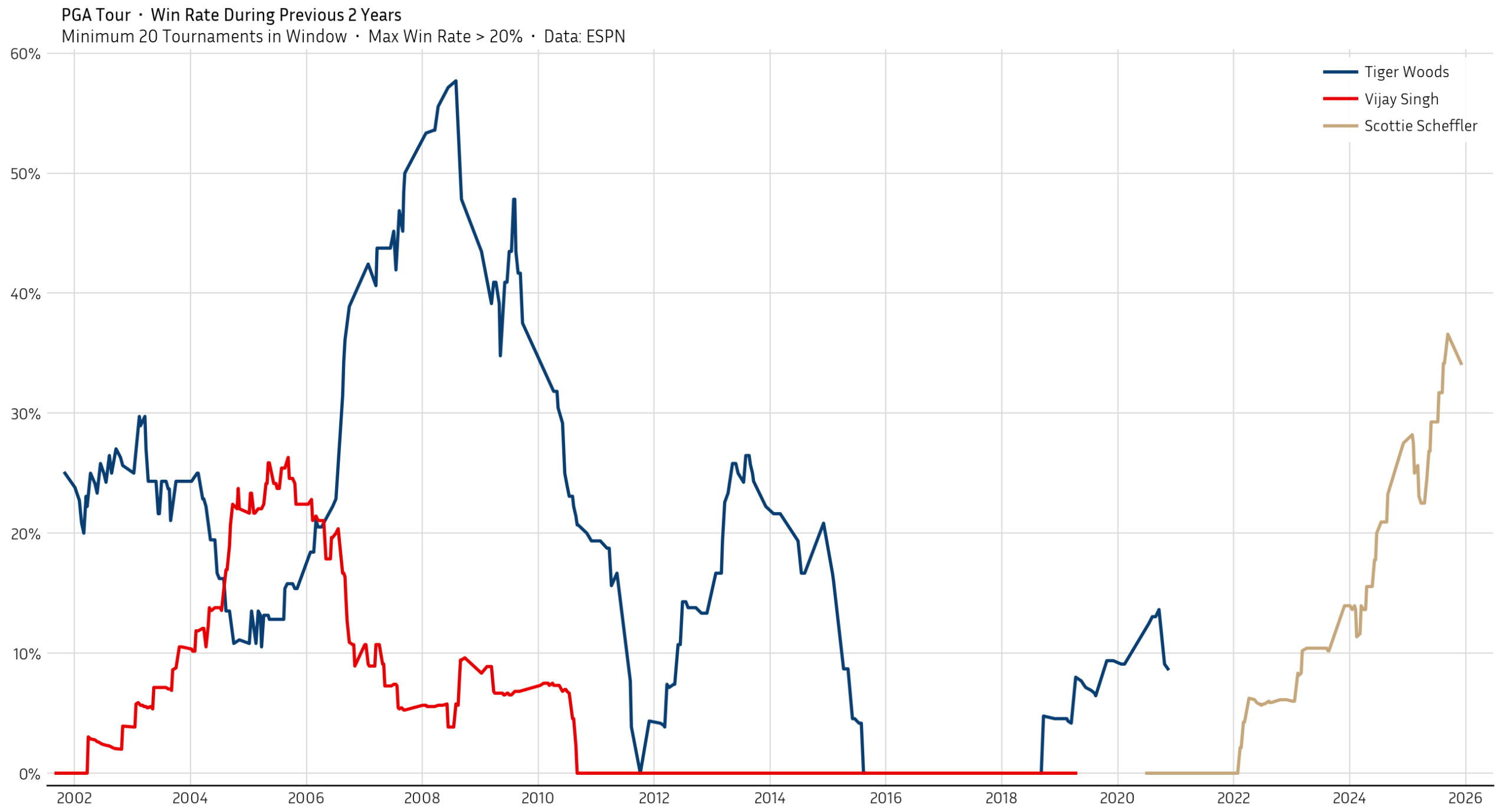
As you can see, Scottie Scheffler isn’t Tiger Woods yet. But his win rate is closer than anyone has gotten since Tiger’s prime—and it continues to trend upward. Scottie’s reputation is well deserved.
It’s worth remembering that the sport has evolved quite a bit in the past 25 years. We calculated how often each player beat their competition, but the competition has grown stronger over time. Tiger recognized it way back in 2013:
I think it’s deeper now than it ever has been. There is more young talent. There are more guys winning golf tournaments for the first time. But if you look at the major championships, how long did we go from basically Phil winning [to] Phil winning? I mean, how many first time winners did we have during that stretch? It’s deeper. It’s more difficult to win events now, and it’s only going to get that way.
Obviously much of that growth can be attributed to Tiger himself. He inspired a whole generation of young golfers.
Today it’s significantly harder for any one person to rise above the field like Tiger did. I believe there’s a very real gap between Scheffler and Woods, but expecting anyone to reach those same heights may be unrealistic.
Putting aside the comparisons, we can confidently say that Scheffler is doing something no one else has done in 15 years. It’s worth taking a moment to appreciate it.
Full code:
import pandas as pd
import matplotlib.pyplot as plt


plt.style.use("wollen_pga.mplstyle")

fig, ax = plt.subplots()

df_all = pd.read_csv("pga_results_2001-2025.tsv",
                     delimiter="\t",
                     parse_dates=["start"],
                     index_col="start")

df_all['win'] = df_all['position'] == "1"

for name in ["Tiger Woods", "Vijay Singh", "Scottie Scheffler"]:
    df = df_all.copy()

    df = df[df['name'] == name]

    df['win_rate'] = df['win'].rolling("730D", min_periods=20).mean() * 100

    ax.plot(df.index, df['win_rate'], label=name)

y_ticks = range(0, 70, 10)
ax.set(yticks=y_ticks,
       yticklabels=[f"{tick}%" for tick in y_ticks],
       ylim=(-1, y_ticks[-1] * 1.005))

x_ticks = pd.date_range(start="January 1 2002", end="January 1 2026", freq="2YS")
x_tick_range = (x_ticks[-1] - x_ticks[0]).days
x_margin = pd.Timedelta(f"{x_tick_range * 0.02} days")
x_left, x_right = x_ticks[0] - x_margin, x_ticks[-1] + x_margin
ax.set(xticks=x_ticks,
       xticklabels=[tick.strftime("%Y") for tick in x_ticks],
       xlim=(x_left, x_right))

ax.text(x=x_left + pd.Timedelta(f"{x_tick_range * 0.01} days"),
        y=y_ticks[-1] * 1.045,
        s="PGA Tour  •  Win Rate During Previous 2 Years",
        weight=400)

ax.text(x=x_left + pd.Timedelta(f"{x_tick_range * 0.01} days"),
        y=y_ticks[-1] * 1.015,
        s="Minimum 20 Tournaments in Window  •  Max Win Rate > 20%  •  Data: ESPN")

ax.legend(loc="upper right")

plt.savefig("pga_win_rate.png", dpi=200)