
The first Sunday after the first full moon after…
I want to follow up on a previous post that used text as a scatter marker. It employed the TextToPath method to (as you might guess) convert text to Path, which is a Matplotlib class similar to an SVG.
This post will demonstrate how to convert any SVG to a Path. It will open the door to an essentially infinite number of marker choices. Rather than being restricted to circles, squares, or even text, you’ll be able to bring up Google Images and pick any SVG image you like.
1. Prepare the data.
Since Easter is this weekend I thought it would be fun to look at Easter Sunday dates over the next few years. The exact date varies quite a bit. It seems to be one of those things we accept without thinking too much about it.
I couldn’t tell you how the date is calculated without looking it up, but I have a text file containing every Easter date through the end of this century. It’s linked at the bottom of this post.
Read the file into a pandas DataFrame and take a look.
import pandas as pd

df = pd.read_csv("easter_dates.csv", parse_dates=["date"])

print(df.head())
The output:
        date
0 2026-04-05
1 2027-03-28
2 2028-04-16
3 2029-04-01
4 2030-04-21
The plan is to make a scatter plot with time variables on both axes:
- x-axis — Year
- y-axis — Month/Day
Let’s first create an integer year column for the x-axis. We can efficiently operate on datetime types by using the dt accessor. This approach skips writing an apply function, which is always slower.
df['x_year'] = df['date'].dt.strftime("%Y").astype(int)
The y-axis is tricky because we want to maintain a datetime type, but we need every date to be within the same year. The exact year doesn’t matter because it won’t be displayed on the plot.
Use strftime again but this time force all month-day pairs to exist in the year 2000.
df['y_date'] = pd.to_datetime(df['date'].dt.strftime("2000-%m-%d"))
Filter the DataFrame down to the next 20 years and take a look.
df = df[df['x_year'] <= 2045]

print(df.head())
The output:
        date  x_year     y_date
0 2026-04-05    2026 2000-04-05
1 2027-03-28    2027 2000-03-28
2 2028-04-16    2028 2000-04-16
3 2029-04-01    2029 2000-04-01
4 2030-04-21    2030 2000-04-21
Our x and y variables are ready to go. We can move on to making a scatter plot with custom markers.
2. Plot the data.
The plot will use a custom “wollen_easter” Matplotlib style that will be linked at the bottom of this post. Fair warning: there’s a lot of pink!
Create a Figure and an Axes instance for plotting.
import matplotlib.pyplot as plt

plt.style.use("wollen_easter.mplstyle")

fig, ax = plt.subplots()
I found this Easter egg SVG that will work as a marker. It’s festive and has enough detail to show off Paths.

We’ll use the svgpath2mpl package to convert SVG markup into vertices and path codes that Matplotlib can understand. In case you’ve never noticed, you can right-click any SVG file and open it in a text editor. You won’t find anything resembling pixels, just a series of instructions for the computer to draw various shapes. That’s essentially the same as a Matplotlib Path.
Use a regex search to isolate the important information. Then call svgpath2mpl.parse_path on each block. Our Easter egg has several unconnected shapes (dots and stripes) so they exist as separate blocks within the markup.
from svgpath2mpl import parse_path
import re

with open("egg.svg", "r") as f:
    text = f.read()

path_parts = [parse_path(item) for item in re.findall(r' d="(.*?)"', text, re.DOTALL)]
But at this point we have several Matplotlib Paths, each representing one tiny piece of the Easter egg.
To combine them we need to separate vertices from codes, which both exist as NumPy arrays, and then concatenate the arrays together.
import numpy as np

vertices_combined = np.concatenate([part.vertices for part in path_parts])
codes_combined = np.concatenate([part.codes for part in path_parts])
Pass repackaged vertices and codes to matplotlib.path.Path.
from matplotlib.path import Path

marker_path = Path(vertices_combined, codes_combined)
Now we have a single Matplotlib Path that contains all of the Easter egg.
But we’re not quite done. A quirk in the SVG format means that we never know if a Path will be rotated or mirrored. In this case, we need to flip it over the horizontal axis. (1, -1) means no change to the horizontal, mirror the vertical.
import matplotlib.transforms as mpltf

marker_path = marker_path.transformed(mpltf.Affine2D().scale(1, -1))
Matplotlib makes no attempt to center Paths so we have to do that manually as well. We can translate it, i.e. slide it left/right/up/down, until it looks centered.
marker_path = marker_path.transformed(mpltf.Affine2D().translate(-258, 265))
It takes a bit of fine-tuning but once a Path is created it’s super versatile within Matplotlib. For example, you could use a Path to clip the edge of a Rectangle or Circle patch. And like SVGs, no information is lost when Paths are scaled up or down.
With custom markers in hand, let’s get back to plotting Easter dates.
I collected the Path code in a get_marker_path function to keep things organized.
All markers on the scatter plot will be Easter eggs, but they don’t have to be the same color. I made a list of five Easter colors to alternate through. color_list needs to be the same length as data columns so scale it using df.shape.
Specify zorder=2 because we’ll do some background shading with fill_between in a moment.
egg_marker = get_marker_path()

color_list = ["#367D83", "#8ADBD2", "#F47A97", "#E9C05F", "#C079F8"]

ax.scatter(x=df['x_year'],
           y=df['y_date'],
           marker=egg_marker,
           s=400,
           linewidth=0,
           color=(color_list * 100)[:df.shape[0]],
           zorder=2)
Easter Sunday can be any date from March 22nd to April 25th. Use pd.date_range to generate a list of dates to serve as y-ticks. “7D” means ticks will be located seven days apart.
All y values exist in the year 2000 but we obviously don’t want that visible on the plot. Use strftime to generate a list of yticklabels that include only month and day.
Year values along the x-axis are integers so they’re more straightforward. Just rotate labels 60 degrees to avoid crowding them together.
y_ticks = pd.date_range(start=pd.Timestamp("March 22, 2000"),
                        end=pd.Timestamp("April 26, 2000"),
                        freq="7D")

ax.set(yticks=y_ticks,
       yticklabels=[date.strftime("%B %-d") for date in y_ticks],
       ylim=(pd.Timestamp("March 20, 2000"), pd.Timestamp("April 28, 2000")),
       xticks=range(2026, 2046),
       xlim=(2025.5, 2045.5))

plt.setp(ax.xaxis.get_majorticklabels(), rotation=60, ha="right", rotation_mode="anchor")
The Figure’s facecolor, i.e. the outer margins of the plot, are pink. Let’s do a yellow background for the Axes.
This loop steps through x-axis year values and creates vertical bars of alternating yellow shades. There isn’t a ton of data communicated on the plot—just 20 scatter markers—so it helps to break up the solid background.
A bool named toggle switches between True and False on each iteration of the loop. The fill color depends on its value.
toggle = True

for year in range(2000, 2100):
    ax.fill_between(x=[year, year + 1],
                    y1=[pd.Timestamp("January 1, 2000"), pd.Timestamp("January 1, 2000")],
                    y2=[pd.Timestamp("December 31, 2000"), pd.Timestamp("December 31, 2000")],
                    color={True: "#F3EB9A", False: "#D3DB8A"}[toggle],
                    alpha=0.13,
                    zorder=1)

    toggle = not toggle
When I want to include a title and a subtitle, it usually works best to place them in the upper-left corner. Matplotlib has no built-in method for subtitles but we can call text a couple times. Just give the subtitle a slightly smaller font size.
ax.text(x=2025.5,
        y=pd.Timestamp("April 30, 2000 at 3 AM"),
        s="Easter Dates  •  2026–2045",
        size=9)

ax.text(x=2025.5,
        y=pd.Timestamp("April 28, 2000 at 6 PM"),
        s="Easter Sunday is the first Sunday following the first full moon after the spring equinox.",
        size=8)
Finally, save the Figure. A 200 dpi makes the Easter egg details easier to see.
plt.savefig("easter_dates.png", dpi=200)
3. The output.
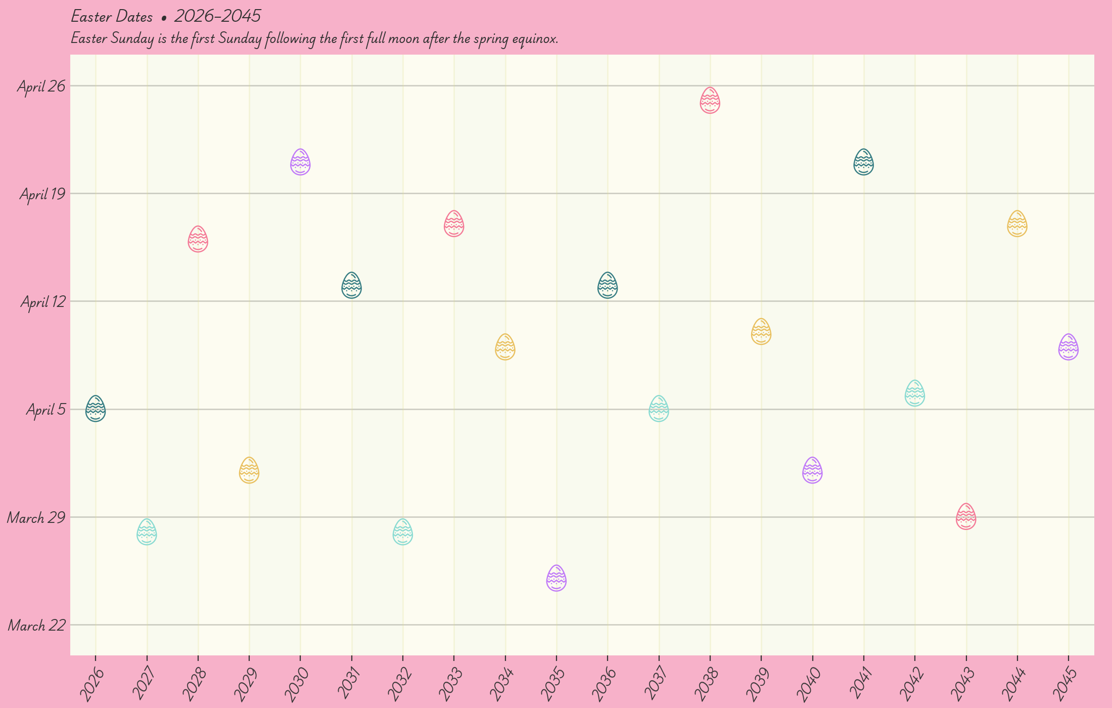
Like I said, pink and yellow aren’t my comfort zone. But I think it looks good! I also generally hate scripty fonts but I can make an exception for holidays.
This year’s April 5th Easter Sunday is a middle-of-the-road date. Not too early, not too late. Next year we’ll be celebrating in March.
Full code:
import pandas as pd
import matplotlib.pyplot as plt
from matplotlib.path import Path
import matplotlib.transforms as mpltf
from svgpath2mpl import parse_path
import numpy as np
import re


def get_marker_path():
    with open("egg.svg", "r") as f:
        text = f.read()
    path_parts = [parse_path(item) for item in re.findall(r' d="(.*?)"', text, re.DOTALL)]
    vertices_combined = np.concatenate([part.vertices for part in path_parts])
    codes_combined = np.concatenate([part.codes for part in path_parts])
    marker_path = Path(vertices_combined, codes_combined)
    marker_path = marker_path.transformed(mpltf.Affine2D().scale(1, -1))
    marker_path = marker_path.transformed(mpltf.Affine2D().translate(-258, 265))
    return marker_path


df = pd.read_csv("easter_dates.csv", parse_dates=["date"])

df['x_year'] = df['date'].dt.strftime("%Y").astype(int)

df['y_date'] = pd.to_datetime(df['date'].dt.strftime("2000-%m-%d"))

df = df[df['x_year'] <= 2045]

plt.style.use("wollen_easter.mplstyle")

fig, ax = plt.subplots()

egg_marker = get_marker_path()

color_list = ["#367D83", "#8ADBD2", "#F47A97", "#E9C05F", "#C079F8"]

ax.scatter(x=df['x_year'],
           y=df['y_date'],
           marker=egg_marker,
           s=400,
           linewidth=0,
           color=(color_list * 100)[:df.shape[0]],
           zorder=2)

y_ticks = pd.date_range(start=pd.Timestamp("March 22, 2000"),
                        end=pd.Timestamp("April 26, 2000"),
                        freq="7D")

ax.set(yticks=y_ticks,
       yticklabels=[date.strftime("%B %-d") for date in y_ticks],
       ylim=(pd.Timestamp("March 20, 2000"), pd.Timestamp("April 28, 2000")),
       xticks=range(2026, 2046),
       xlim=(2025.5, 2045.5))

plt.setp(ax.xaxis.get_majorticklabels(), rotation=60, ha="right", rotation_mode="anchor")

toggle = True

for year in range(2000, 2100):
    ax.fill_between(x=[year, year + 1],
                    y1=[pd.Timestamp("January 1, 2000"), pd.Timestamp("January 1, 2000")],
                    y2=[pd.Timestamp("December 31, 2000"), pd.Timestamp("December 31, 2000")],
                    color={True: "#F3EB9A", False: "#D3DB8A"}[toggle],
                    alpha=0.13,
                    zorder=1)

    toggle = not toggle

ax.text(x=2025.5,
        y=pd.Timestamp("April 30, 2000 at 3 AM"),
        s="Easter Dates  •  2026–2045",
        size=9)

ax.text(x=2025.5,
        y=pd.Timestamp("April 28, 2000 at 6 PM"),
        s="Easter Sunday is the first Sunday following the first full moon after the spring equinox.",
        size=8)

plt.savefig("easter_dates.png", dpi=200)