
Celebrating five years (knock on wood)
I try to squeeze as much customization into my plots as I can, but the Matplotlib rabbit hole goes deep. Buried in the documentation you’ll find bizarre relics seemingly from a different world.
Need a discrete colorbar with variable-width log-scale patches and custom end caps? Matplotlib has you covered. How about a map of the night sky using the Aitoff projection? Oh, you need the Lambert projection instead? That’s fine too.
I don’t pretend to know half of what’s there. I’m familiar enough to find what I need in the documentation when I need it, which is the important thing. And I appreciate that smart people are so dedicated to supporting those features. You never know what tools you’ll need tomorrow.
1. Paths.
To celebrate five years of writing blog posts (mostly for Claude at this point) let’s dig into something niche but also fun.
Matplotlib lets you create custom markers. When calling scatter() you can pass a list of tuples that define an arbitrary polygon. For example, here’s a goofy-looking trapezoid:
ax.scatter(x=range(-2, 3),
           y=range(-2, 3),
           marker=[(-1, -1), (-1, 1), (1, 0.4), (1, -0.4), (-1, -1)],
           s=300,
           edgecolor="black",
           linewidth=1.0)
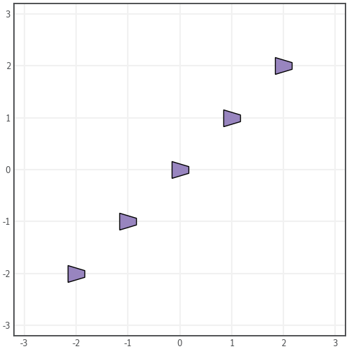
Or for a more scalable approach, pass a Path object. Think of it like the path your finger would trace around the edge of a shape. It’s very similar to an SVG file.
A Path’s basic structure is composed of vertices and codes. Vertices are points in (x, y) space and codes tell Matplotlib how exactly it should travel between points. You could build a simple triangle like this:
verts = [(0, 0), (1, 1), (2, 0), (0, 0)]
codes = [Path.MOVETO, Path.LINETO, Path.LINETO, Path.CLOSEPOLY]
In this post I want to create a Path from plain text—namely the W logo of this web site. That seems celebratory enough.
Unsurprisingly if you’ve read the documentation, Matplotlib has a built-in API for this. There’s no need to tediously locate edges by hand or to jerry-rig your own Python solution. The process requires three imports and three lines of code.
First, generate a Path using the aptly named TextToPath method. It returns vertices and codes as discussed above.
from matplotlib.textpath import TextToPath
from matplotlib.font_manager import FontProperties

verts, codes = TextToPath().get_text_path(FontProperties(family="Federant", style="normal"), "W")
Unfortunately it returns the Path of a bottom-left-aligned character, so markers will be drawn to the right and above where we want them. I don’t think there’s a good way to override this behavior on creation. If there is, please let me know!
Fortunately it’s easy to translate the Path leftward and downward. Under the hood, verts is just a NumPy array. Add a second NumPy array containing x and y offsets to center the marker. Matplotlib Transforms would work as well if you’d prefer a built-in method.
verts += np.array([-50.0, -34.0])
Then pass the instructions to Path.
from matplotlib.path import Path

marker_path = Path(verts, codes)
Now we can use little W markers instead of circles or the other default options. If you aren’t excited yet, you’re in the wrong place!
2. Prepare the data.
To use those markers we also need data. Since the traditional five-year anniversary gift is wood, let’s go with something exciting—like lumber statistics.
I scraped info about 584 wood species from wood-database.com. The full dataset includes 17 columns but I took the liberty of trimming it down for this post. We’ll deal with two variables: elastic modulus and hardness.
These are material properties that, like much of the Matplotlib library, a normal person will never have to worry about. The variables happen to have a relationship that lends itself well to a scatter plot, which will allow us to show off custom markers.
Start by reading the dataset and dropping rows with missing data. It’s a tab-separated file so pass an argument to delimiter.
import pandas as pd

df = pd.read_csv("wood_database_trimmed.tsv", delimiter="\t")

df = df.dropna(subset=['janka_hardness', 'modulus_of_elasticity'])
We can jump straight to a linear regression. The details don’t really matter but conceptually, we’re modeling hardness as the independent variable and elastic modulus as dependent.
- If a material is hard, it means it’s tough to leave a mark on it. You have to apply more force to make a dent.
- A higher elastic modulus means the wood is stiffer. It takes more force per unit area (pressure) to bend the wood out of its natural shape. Elastic implies the strain is small enough that the wood will snap back to its original shape. That’s in contrast to plastic deformation, which is permanent.
The plot will show how correlated the two variables are. You would assume that a hard wood is stiffer, generally speaking, but how strong is the relationship?
Use scipy.stats.linregress to find out.
from scipy.stats import linregress

slope, intercept, r_value, p_value, std_err = linregress(df['janka_hardness'], df['modulus_of_elasticity'])
Take the regression line’s slope and intercept and generate a list of points. We’ll layer a line on top of the scatter plot in a moment.
x_reg = [df['janka_hardness'].min(), df['janka_hardness'].max()]
y_reg = [n * slope + intercept for n in x_reg]
3. Plot the data.
I’ll use a custom wollen.org-themed Matplotlib style. It will be linked at the bottom of this post.
import matplotlib.pyplot as plt

plt.style.use("wollen_org.mplstyle")
Let’s go a step further and include histograms of the x and y variables. We can arrange them along the edges of the scatter plot, like this:
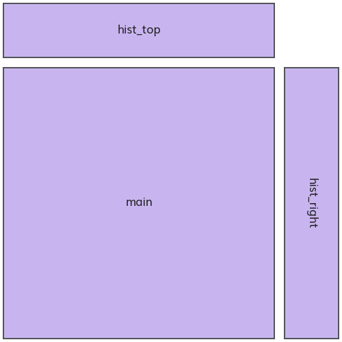
The x variable’s distribution will be plotted on hist_top and the y variable on hist_right.
You could use plt.subplots(2, 2) to achieve this layout, but subplot_mosaic makes things a little easier. It allows for naming the Axes when creating them.
fig, axs = plt.subplot_mosaic([["hist_top", "."],
                               ["main", "hist_right"]],
                              width_ratios=(5, 1),
                              height_ratios=(1, 5),
                              gridspec_kw={"wspace": 0.06,
                                           "hspace": 0.06})
Now we can address the “main” Axes by name. Call scatter to plot the data.
This is where we pass the custom W marker_path created earlier.
Set linewidth=0 to avoid turning the markers into ugly bold Ws. Matplotlib tries to draw a line around the Path’s perimeter, but in this case, the details are too small.
Set zorder=1 so we can layer the regression line on top.
axs["main"].scatter(df['janka_hardness'],
                    df['modulus_of_elasticity'],
                    color="#9885BF",
                    marker=marker_path,
                    s=100,
                    linewidth=0,
                    zorder=1)
Plot the regression line on the “main” Axes as well. Pass a higher zorder value so the line appears on top of scatter markers.
axs["main"].plot(x_reg,
                 y_reg,
                 color="#1F2123",
                 zorder=2)
We can combine axes ticks and labels into a single set method. Elastic modulus values tend to be very large (in the millions of psi) so let’s save space by providing formatted strings to yticklabels.
x_ticks = range(0, 6000, 1000)
x_lim = (-100, 5100)
y_ticks = np.arange(0, 5e6, 5e5)
y_tick_labels = [f"{n / 1e6:.1f}M" if n > 0 else "0" for n in y_ticks]
y_lim=(0, 4.6e6)

axs["main"].set(xticks=x_ticks,
                yticks=y_ticks,
                yticklabels=y_tick_labels,
                xlim=x_lim,
                ylim=y_lim,
                xlabel="Janka Hardness (lbf)",
                ylabel="Elastic Modulus  (lbf/in²)")
That’s it for the scatter plot. We can move to histograms. The x variable, hardness, appears on the “hist_top” Axes.
Pandas has a convenient hist method for turning DataFrames into histograms. You just need to define bin boundaries. This list of values should include the left edge of the leftmost bin and the right edge of the rightmost bin.
rwidth refers to relative width. A value of 0.7 means bars will be 70% as wide as the bin’s data range. There will be 30% white space between them.
df.hist(column="janka_hardness",
        bins=range(0, 4800, 100),
        rwidth=0.7,
        ax=axs["hist_top"])
It’s a matter of style but I think it looks good to remove axis labels from the histograms. They already appear on the “main” Axes so no important information is lost.
Pandas tries to force a title by default. Let’s remove it by passing an empty string.
axs["hist_top"].set(xticks=x_ticks,
                    xticklabels=[],
                    xlim=x_lim,
                    yticks=[],
                    title="")
Then repeat the process for the y variable on “hist_right”.
df.hist(column="modulus_of_elasticity",
        bins=range(0, 4700000, 100000),
        rwidth=0.7,
        orientation="horizontal",
        ax=axs["hist_right"])

axs["hist_right"].set(xticks=[],
                      yticks=y_ticks,
                      yticklabels=[],
                      ylim=y_lim,
                      title="")
Use text to place a title in the upper-left corner of “main”. Cite the data source in the lower-right.
axs["main"].text(x=-50,
                 y=4.55e6,
                 s=f"Lumber Species\nHardness • Stiffness\nR²={r_value**2:.2f}",
                 size=9,
                 ha="left",
                 va="top")

axs["main"].text(x=4980,
                 y=0.01e6,
                 s="Data: wood-database.com",
                 size=9,
                 ha="right",
                 va="bottom")
Finally, save the figure. It’s a good idea to increase dpi on account of the W markers’ fine detail.
plt.savefig("lumber_hardness_stiffness.png", dpi=200)
4. The output.
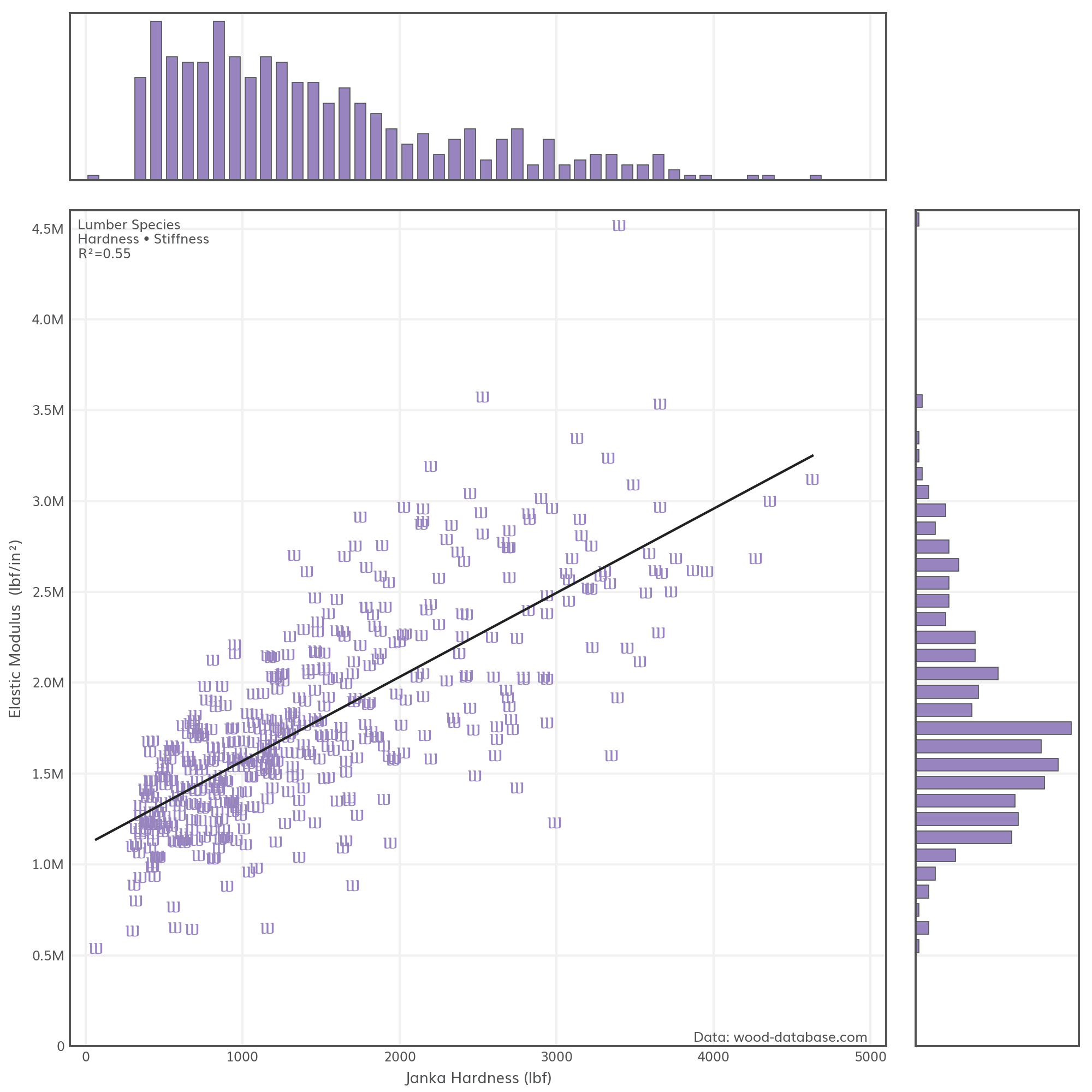
Lumber hardness and stiffness have a moderately strong correlation (R²=0.55) but there’s still plenty of variability between species. That makes sense for an organic material like wood.
It’s worth noting that the scatter’s “funnel” shape is a sign of heteroscedasticity. Variance isn’t constant along the x-range, which is an implicit assumption when calculating R², so the correlation is likely overstated.
Would I present this as a serious data visualization? Of course not. The Ws look silly and have no real connection to lumber. Not to mention the questionable regression analysis. This plot is more a demonstration of Paths as markers in Matplotlib. They get the job done and hopefully open the door to more sensible applications.
With a little work you can adapt any SVG graphic to serve as a marker, like in this recent Easter date visualization.
It’s hard to believe I’ve been writing these posts for five years. I hope I’ve mixed in a few good ones. I don’t know if I’ll still be here five years from now but I’m glad to have made it this far. The process has forced me to push my limits and continue learning. Thanks for reading.
Full code:
import pandas as pd
import numpy as np
from scipy.stats import linregress
import matplotlib.pyplot as plt
from matplotlib.textpath import TextToPath
from matplotlib.font_manager import FontProperties
from matplotlib.path import Path


df = pd.read_csv("wood_database_trimmed.tsv", delimiter="\t")

df = df.dropna(subset=['janka_hardness', 'modulus_of_elasticity'])

slope, intercept, r_value, p_value, std_err = linregress(df['janka_hardness'], df['modulus_of_elasticity'])

x_reg = [df['janka_hardness'].min(), df['janka_hardness'].max()]
y_reg = [n * slope + intercept for n in x_reg]

plt.style.use("wollen_org.mplstyle")

fig, axs = plt.subplot_mosaic([["hist_top", "."],
                               ["main", "hist_right"]],
                              width_ratios=(5, 1),
                              height_ratios=(1, 5),
                              gridspec_kw={"wspace": 0.06,
                                           "hspace": 0.06})

verts, codes = TextToPath().get_text_path(FontProperties(family="Federant", style="normal"), "W")
verts += np.array([-50.0, -34.0])
marker_path = Path(verts, codes)

axs["main"].scatter(df['janka_hardness'],
                    df['modulus_of_elasticity'],
                    color="#9885BF",
                    marker=marker_path,
                    s=100,
                    linewidth=0,
                    zorder=1)

axs["main"].plot(x_reg,
                 y_reg,
                 color="#1F2123",
                 zorder=2)

x_ticks = range(0, 6000, 1000)
x_lim = (-100, 5100)
y_ticks = np.arange(0, 5e6, 5e5)
y_tick_labels = [f"{n / 1e6:.1f}M" if n > 0 else "0" for n in y_ticks]
y_lim=(0, 4.6e6)

axs["main"].set(xticks=x_ticks,
                yticks=y_ticks,
                yticklabels=y_tick_labels,
                xlim=x_lim,
                ylim=y_lim,
                xlabel="Janka Hardness (lbf)",
                ylabel="Elastic Modulus  (lbf/in²)")

df.hist(column="janka_hardness",
        bins=range(0, 4800, 100),
        rwidth=0.7,
        ax=axs["hist_top"])

axs["hist_top"].set(xticks=x_ticks,
                    xticklabels=[],
                    xlim=x_lim,
                    yticks=[],
                    title="")

df.hist(column="modulus_of_elasticity",
        bins=range(0, 4700000, 100000),
        rwidth=0.7,
        orientation="horizontal",
        ax=axs["hist_right"])

axs["hist_right"].set(xticks=[],
                      yticks=y_ticks,
                      yticklabels=[],
                      ylim=y_lim,
                      title="")

axs["main"].text(x=-50,
                 y=4.55e6,
                 s=f"Lumber Species\nHardness • Stiffness\nR²={r_value**2:.2f}",
                 size=9,
                 ha="left",
                 va="top")

axs["main"].text(x=4980,
                 y=0.01e6,
                 s="Data: wood-database.com",
                 size=9,
                 ha="right",
                 va="bottom")

plt.savefig("lumber_hardness_stiffness.png", dpi=200)