
NBA shot location heatmaps
I’ll be honest, I really wanted to do a Miami Heat pun. Adebayo, Herro, and Powell are great but they just aren’t as recognizable as Luka Dončić [I won’t use the fancy Cs again].
The plan is to create a heatmap of Luka’s field goal attempts during the 2025-26 regular season. It will go beyond 2PA and 3PA stats and show exactly where on the court he took his shots. We know Luka is an excellent shooter but where does he prefer to shoot from?
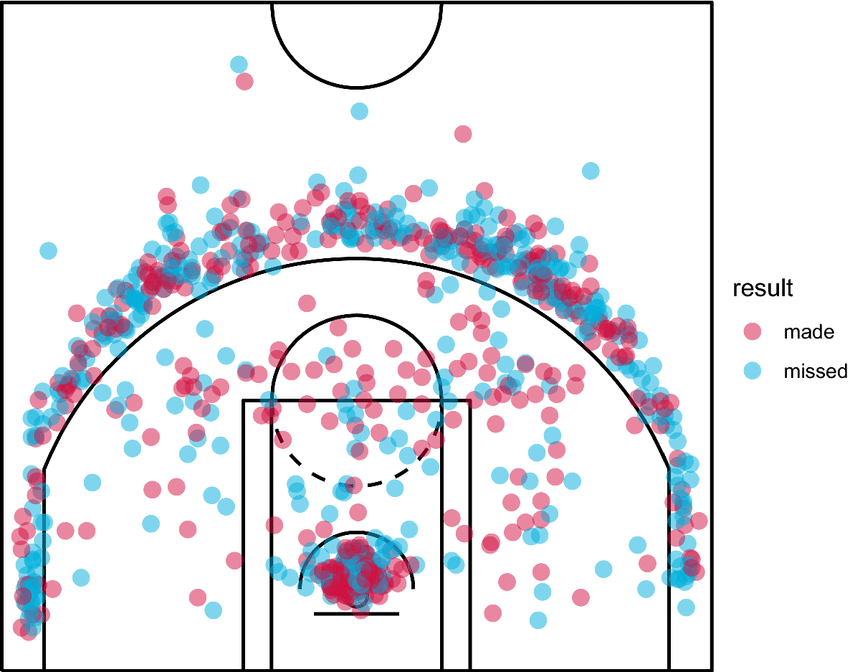
We’ll make something similar to a traditional shot chart (example below) but try to elevate it visually.
1. What’s a heatmap?
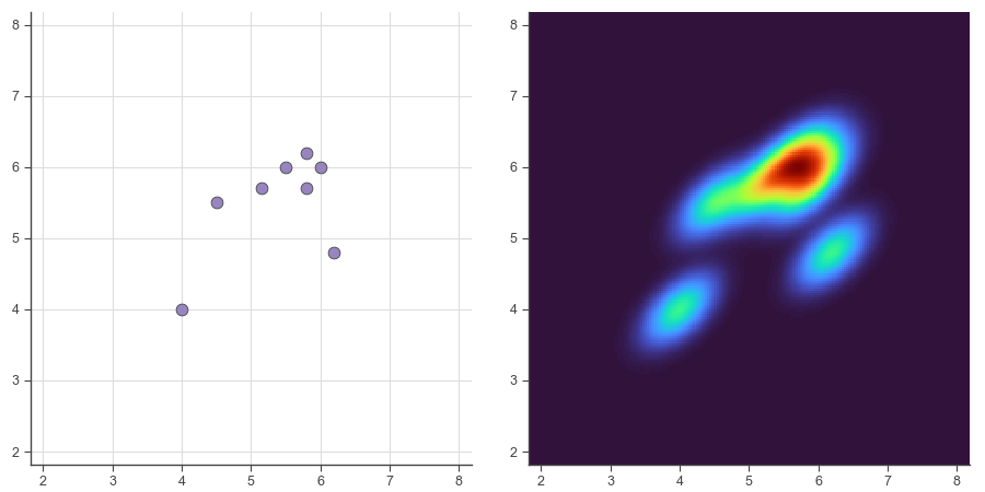
Just like a histogram visualizes a variable’s distribution along one dimension, a heatmap operates on two dimensions. A classic heatmap has square bins. The more points in a bin, the darker the color.
That makes sense. We could divide the basketball court into a grid and count how many shots fall within each square.
The main drawback is what happens at boundaries. For example, the two points near (20, 20) are right next to each other but they contribute to different bins. As far as the math is concerned they’re totally unrelated data points. A blocky, discontinuous approach like this can obscure what the data is saying.
You might think, “Okay, so make the squares tiny.” That would definitely improve things and we’ll do that, but we can go a step further. Instead of simply grouping shots into bins and counting them, we can look at precise spots on the court and calculate a weighted total of every shot nearby. Because they’re weighted, shots closer to the spot will contribute more than shots further away.
If you repeat that calculation many times all over the court you’ll end up smoothing out the data. This technique is called a Kernel Density Estimate (KDE). It will let us analyze the data in a smooth, continuous way and easily identify “hot spots” on the court.
2. Prepare the data.
More often than not, the best way to pull NBA stats is from nba.com. The data on their web site is provided by an internal API that remains open to the public—at least for now. nba_api is a Python client to interface with it.
Once you’ve installed the package you can start pulling data. First you’ll need a player’s ID. You can find it in the player URL on nba.com or search for it this way.
from nba_api.stats.static import players

player_list = players.find_players_by_full_name("Luka Dončić")
We want shot chart data so we’ll use the shotchartdetail endpoint.
Pass Luka’s player_id here. team_id=0 ensures that we receive a player’s complete stats even if they’ve been traded. It’s not necessary for Luka but I usually include it anyway. The other arguments specify the stat we’re interested in (field goal attempts) and coverage (2025-26 regular season).
from nba_api.stats.endpoints import shotchartdetail

response = shotchartdetail.ShotChartDetail(player_id=1629029,
                                           team_id=0,
                                           season_nullable="2025-26",
                                           season_type_all_star="Regular Season",
                                           context_measure_simple="FGA")
nba_api can package the data into a dictionary, a JSON object, or a pandas DataFrame. I prefer pandas.
import pandas as pd

df = response.get_data_frames()[0]
The DataFrame includes 24 columns so I won’t try to print it here. Suffice it to say you could spend a lot of time working with stats from this one endpoint alone.
We’re most interested in (x, y) locations of shots, which are found in the LOC_X and LOC_Y columns. Let’s narrow down the DataFrame and take a look.
print(df[['GAME_ID', 'PLAYER_NAME', 'EVENT_TYPE', 'LOC_X', 'LOC_Y']].head())
The output:
    GAME_ID  PLAYER_NAME   EVENT_TYPE  LOC_X_FT  LOC_Y_FT
0  22500002  Luka Dončić    Made Shot      -6.0     17.75
1  22500002  Luka Dončić  Missed Shot       1.8     31.15
2  22500002  Luka Dončić    Made Shot      -8.8     30.05
3  22500002  Luka Dončić  Missed Shot     -16.7     26.95
4  22500002  Luka Dončić  Missed Shot       0.2      8.05
We don’t have to worry about made vs. missed shots because we’re interested in overall shot selection. At this point, if you wanted to, you could take the DataFrame and create something like the shot chart at the top of this post. But let’s keep pushing forward.
LOC_X and LOC_Y use an odd unit system. You might think those numbers are inches but they’re not. They’re actually tenths of a foot. So 157 means 15.7 feet. For some reason. Let’s go ahead and divide the values by 10 and create new columns named LOC_X_FT and LOC_Y_FT.
The data assumes the hoop is at the top of the screen. That’s how shot charts are presented on nba.com so it makes sense. If we plot the data as-is with (0, 0) at the bottom, right-corner threes will be plotted as left-corner threes, and so on. We could transform the data now, i.e. subtract LOC_Y from 940 (a court is 94 feet long). But it will be easier to skip it and call ax.invert_yaxis later.
Additionally, y=0 is located at the center of the hoop, which is 5’3″ from the baseline, so we need to add 5.25. Our y=0 will be the baseline.
df['LOC_X_FT'] = df['LOC_X'] / 10

df['LOC_Y_FT'] = df['LOC_Y'] / 10 + 5.25
Now we have the necessary (x, y) shot data for a heatmap. The code seems tricky at first but it’s only a few lines. Let’s walk through what each line is doing.
linspace is simple. It returns a list of evenly spaced values between two limits. -25 to 25 corresponds to a basketball court’s 50-ft width. 0 to 47.5 is the length of a half court. All of Luka’s shot coordinates will fall within these bounds. A higher number of steps will be less “grainy,” but I prefer a little grain. 200 is a nice medium value.
Use these lists to create a NumPy meshgrid. This method returns a pair of 2D arrays that together represent points within the grid layout. Think of them like a map overlaid on the basketball court.
import numpy as np

x_grid = np.linspace(-25, 25, 200)
y_grid = np.linspace(0, 47.5, 200)
x_grid, y_grid = np.meshgrid(x_grid, y_grid)
Then create a KDE model. gaussian_kde accepts the real-world data. It returns a model that can be used to estimate values within its 2D area.
np.vstack is a bit of a curveball but don’t let it trip you up. It simply arranges the two pandas Series into a vertically stacked 2D array, which is how guassian_kde expects the data.
bw_method is an optional parameter that tweaks how the algorithm handles nearby points. A low bandwidth, like 0.04, will reveal more local maxima (hot spots) in the data. A higher bandwidth will tend to blur peaks together into a single large spot. Using a value this low is often a bad idea because it can convey false precision, but for a heatmap I think it’s justified. We aren’t trying to build a model to predict Luka’s future shots out of sample. We’re visualizing his shot selection in the 2025-26 season.
from scipy.stats import gaussian_kde

kde_model = gaussian_kde(np.vstack([df['LOC_X_FT'], df['LOC_Y_FT']]), bw_method=0.04)
Now we have a KDE model capable of calculating values within the 2D area (the basketball court). We need to tell the model what points we’re interested in. That is, all the points contained in x_grid and y_grid.
positions is essentially an array of (x, y) ordered pairs. Once again, we vertically stack the data because that’s how the model expects it.
Pass those coordinates into kde_model to do the calculations. It returns a 1D array so we reshape it to match our 2D arrays.
z_density is the final product. It’s the 2D array of “heat” values that we’ll plot in a moment.
positions = np.vstack([x_grid.flatten(), y_grid.flatten()])

z_density = np.reshape(kde_model(positions), x_grid.shape)
To recap, we’ve taken a scattershot of points (Luka’s shot data) and created a regularly spaced, fine mesh grid of smoothed points. z_density has a lot more elements than the data we pulled from the API.
You might notice how similar this KDE code is to our Matterhorn’s grid interpolation in a previous post. The scripts generate very different plots but both involve laying out a meshgrid and calculating a value at each point. Except in this case, values will be visualized with color (2D) rather than elevation (3D).
3. Plot the data.
I’ll use a custom Matplotlib style that will be linked at the bottom of this post.
Create a Figure and an Axes instance (ax) for plotting.
import matplotlib.pyplot as plt

plt.style.use("wollen_shooting.mplstyle")

fig, ax = plt.subplots()
We have a couple options for heatmap arrays in Matplotlib. In most cases, pcolormesh is the best choice. imshow can be slightly faster but it treats the grid like square pixels, so you have to think about aspect ratio. Let’s stick with the more flexible method.
Pass in the 2D arrays we created before. cmap refers to Matplotlib’s colormap. It’s the palette that will determine how hot and cold spots are presented. You can experiment with cmap and change the style dramatically. Or create your own color map.
ax.pcolormesh(x_grid, y_grid, z_density, cmap="turbo")
Next, paint all the important markings on the court. It requires a bunch of lines, a few arcs, and a circle. You could certainly add more detail if you wanted.
from matplotlib.patches import Arc, Circle


def paint_court(axes):
    for x_vals, y_vals in [([-25, 25], [47, 47]),
                           ([-3, 3], [4, 4]),
                           ([-8, -8], [0, 19]),
                           ([8, 8], [0, 19]),
                           ([-8, 8], [19, 19]),
                           ([-22, -22], [0, 14]),
                           ([22, 22], [0, 14])]:
        axes.plot(x_vals, y_vals, color="white", lw=2)
    axes.add_artist(Circle((0, 5.25), 0.75, lw=2, ec="white", fc="None"))
    axes.add_artist(Arc((0, 5.25), width=47.4, height=47.4, angle=0, theta1=21.8, theta2=158.2, lw=2, ec="white", fc="None"))
    axes.add_artist(Arc((0, 5.25), width=8, height=8, angle=0, theta1=0, theta2=180, lw=2, ec="white", fc="None"))
    axes.add_artist(Arc((0, 19), width=10, height=10, angle=0, theta1=0, theta2=180, lw=2, ec="white", fc="None"))
    axes.add_artist(Arc((0, 47), width=12, height=12, angle=0, theta1=180, theta2=0, lw=2, ec="white", fc="None"))


paint_court(ax)
Tick labels are mostly straightforward except I want to mirror y-ticks on the right-hand side of the plot. We can do this by calling ax.twinx. I think it helps to see court measurements in feet to judge how long certain shots are.
x_ticks = range(-25, 30, 5)
x_tick_labels = [f"{abs(n)} ft" if n != 0 else "0" for n in x_ticks]

y_ticks = range(0, 50, 5)
y_tick_labels = [f"{abs(n)} ft" if n != 0 else "0" for n in y_ticks]

ax.set(xticks=x_ticks,
       xticklabels=x_tick_labels,
       xlim=(-25, 25),
       yticks=y_ticks,
       yticklabels=y_tick_labels,
       ylim=(0, 47.5))

ax1 = ax.twinx()

ax1.set(yticks=y_ticks,
        yticklabels=y_tick_labels,
        ylim=(0, 47.5))
As I mentioned earlier, data from nba.com assumes the hoop (0, 0) is at the top of the plot. That’s no problem. We can simply invert both y axes.
ax.invert_yaxis()
ax1.invert_yaxis()
Finally, save the figure. A high dpi makes a real difference in this case because of all the detail.
plt.savefig("luka_fga.png", dpi=300)
4. The output.
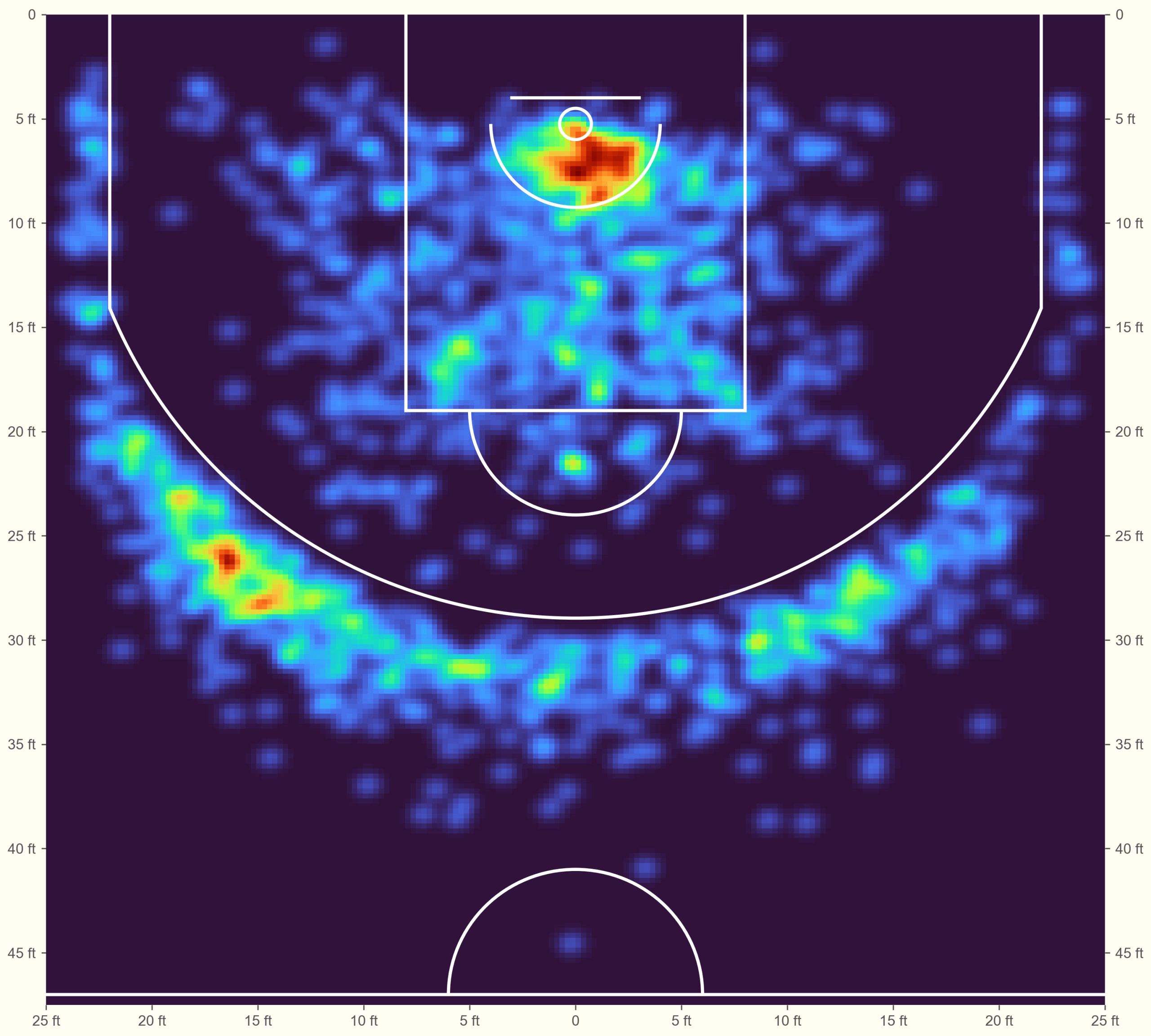
Luka’s shot chart is more interesting than the Miami Heat squad anyway!
Notice his preference for shooting threes from the left. It also stands out how much right-handed Luka prefers layups from that side of the basket. Still, the “blob” in the protected area is reasonably balanced. Some smaller players show a tendency to attack from the baseline rather than directly through the defense.
These charts are great for side-by-side comparison. I won’t post the code but you can easily arrange several players into a subplot grid. Below are the top eight scorers of the 2025-26 season.
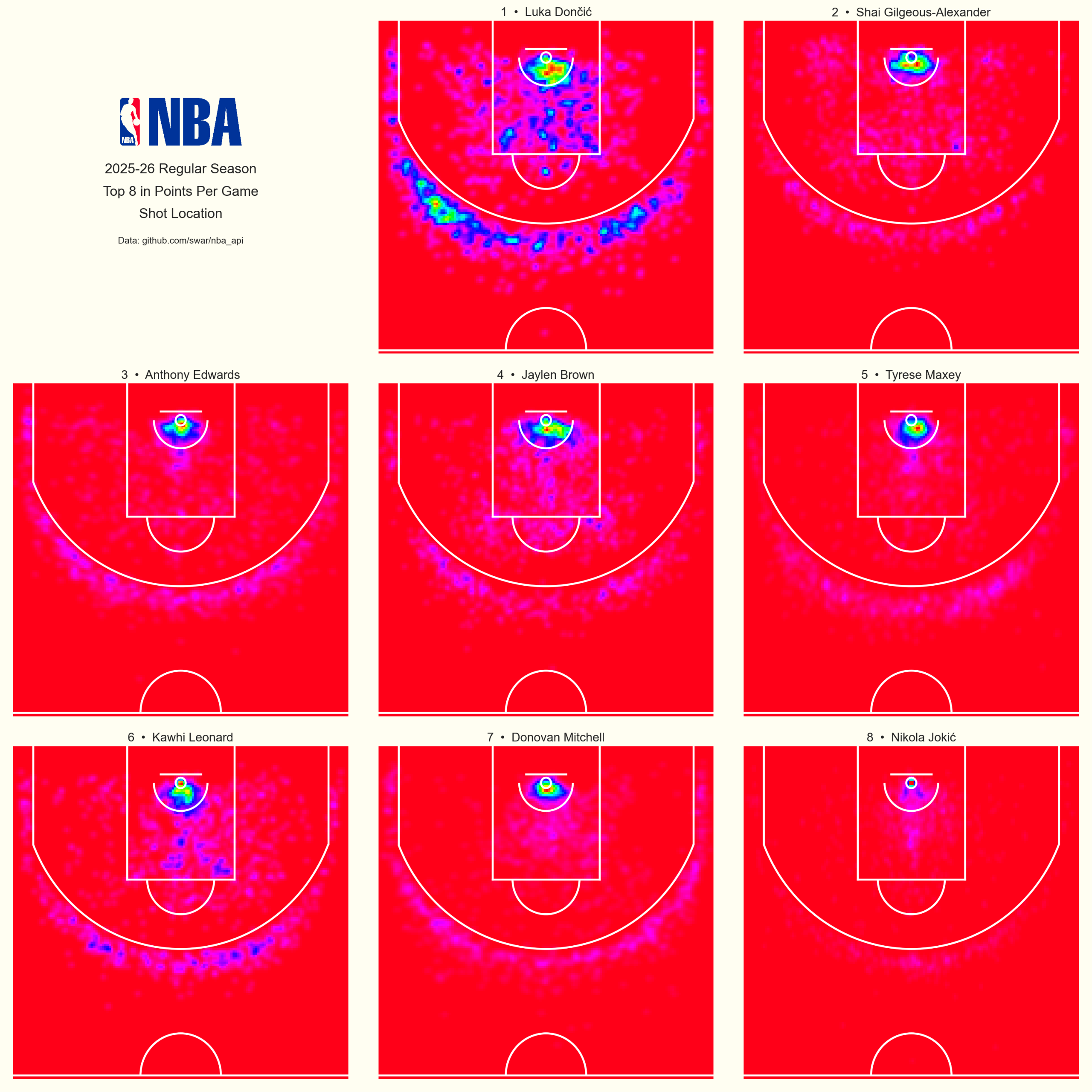
I’m sure these maps are something every NBA analytics team keeps an eye on.
It’s clear that Luka takes a wider variety of shots than other top scorers. No surprise there. His versatility makes him one of the most exciting players to watch. Be aware that colors are normalized for each player. Red on one map doesn’t represent the same shot volume as red on another.
This plot uses cmap="hsv_r" just to mix things up. I think it looks sharp.
Download the Matplotlib style.
Full code:
from nba_api.stats.endpoints import shotchartdetail
import pandas as pd
from scipy.stats import gaussian_kde
import numpy as np
import matplotlib.pyplot as plt
from matplotlib.patches import Arc, Circle


def paint_court(axes):
    for x_vals, y_vals in [([-25, 25], [47, 47]),
                           ([-3, 3], [4, 4]),
                           ([-8, -8], [0, 19]),
                           ([8, 8], [0, 19]),
                           ([-8, 8], [19, 19]),
                           ([-22, -22], [0, 14]),
                           ([22, 22], [0, 14])]:
        axes.plot(x_vals, y_vals, color="white", lw=2)
    axes.add_artist(Circle((0, 5.25), 0.75, lw=2, ec="white", fc="None"))
    axes.add_artist(Arc((0, 5.25), width=47.4, height=47.4, angle=0, theta1=21.8, theta2=158.2, lw=2, ec="white", fc="None"))
    axes.add_artist(Arc((0, 5.25), width=8, height=8, angle=0, theta1=0, theta2=180, lw=2, ec="white", fc="None"))
    axes.add_artist(Arc((0, 19), width=10, height=10, angle=0, theta1=0, theta2=180, lw=2, ec="white", fc="None"))
    axes.add_artist(Arc((0, 47), width=12, height=12, angle=0, theta1=180, theta2=0, lw=2, ec="white", fc="None"))


response = shotchartdetail.ShotChartDetail(player_id=1629029,
                                           team_id=0,
                                           season_nullable="2025-26",
                                           season_type_all_star="Regular Season",
                                           context_measure_simple="FGA")

df = response.get_data_frames()[0]

df['LOC_X_FT'] = df['LOC_X'] / 10

df['LOC_Y_FT'] = df['LOC_Y'] / 10 + 5.25

x_grid = np.linspace(-25, 25, 200)
y_grid = np.linspace(0, 47.5, 200)
x_grid, y_grid = np.meshgrid(x_grid, y_grid)

kde_model = gaussian_kde(np.vstack([df['LOC_X_FT'], df['LOC_Y_FT']]), bw_method=0.04)

positions = np.vstack([x_grid.flatten(), y_grid.flatten()])

z_density = np.reshape(kde_model(positions), x_grid.shape)

plt.style.use("wollen_shooting.mplstyle")

fig, ax = plt.subplots()

ax.pcolormesh(x_grid, y_grid, z_density, cmap="turbo")

paint_court(ax)

x_ticks = range(-25, 30, 5)
x_tick_labels = [f"{abs(n)} ft" if n != 0 else "0" for n in x_ticks]

y_ticks = range(0, 50, 5)
y_tick_labels = [f"{abs(n)} ft" if n != 0 else "0" for n in y_ticks]

ax.set(xticks=x_ticks,
       xticklabels=x_tick_labels,
       xlim=(-25, 25),
       yticks=y_ticks,
       yticklabels=y_tick_labels,
       ylim=(0, 47.5))

ax1 = ax.twinx()

ax1.set(yticks=y_ticks,
        yticklabels=y_tick_labels,
        ylim=(0, 47.5))

ax.invert_yaxis()
ax1.invert_yaxis()

plt.savefig("luka_fga.png", dpi=300)
References
1. Zuccolotto, P., Sandri, M., & Manisera, M. (2021). Spatial Performance Indicators and Graphs in Basketball. Social Indicators Research, 156, 1–14. https://doi.org/10.1007/s11205-019-02237-2