
How often does a touchdown favorite win?
It’s August, which means we’ve officially reached the month that football starts. We had the World Cup in June-July so the summer sports drought wasn’t as miserable as usual, but it’s always nice to have kickoff in our sights.
Today the question is: how often does a 7-point favorite win the game? In other words, what’s the relationship between point spread and win percentage?
I have a college football dataset we can use to calculate win percentages. This topic also gives us an opportunity to work with nonlinear regression. In general I’m a strong believer in plain, ordinary simple linear regression (or multiple regression) and its ability to outperform more sophisticated models, but sometimes we’ll encounter data that looks like this:
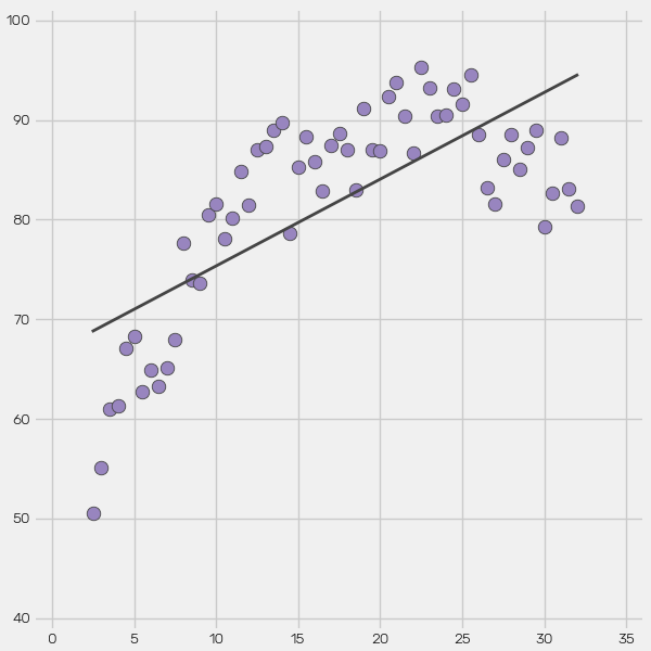
You don’t need any technical definitions to know the linear model is misspecified. The relationship between X and Y obviously follows a curved path.
Rather than a simple linear regression of this form:
 where we calculate slope (m) and intercept (b), we need a nonlinear model of this form:

We can use SciPy to calculate coefficients A, B, and C and fit a model. Of course a real statistician would use Greek symbols and better notation but it really isn’t necessary. It boils down to a parabola equation. Occasionally you’ll want a higher-order polynomial but the approach is the same.
Our college football spread-win% data is nonlinear, similar to the randomly generated data above. Let’s work on building a model.
1. Prepare the data.
Start by loading the dataset into a pandas DataFrame.
import pandas as pd

pd.set_option("display.expand_frame_repr", False)    # Improves printing to screen.

df = pd.read_csv("cfb_spreads_1978-2025.csv", parse_dates=['date'])

print(df.head())
The output:
        date  season            away               home  score_away  score_home whos_favored  spread
0 1978-09-01    1978      Penn State             Temple          10           7         away    24.5
1 1978-09-02    1978  Arkansas State              Tulsa          20          21         home     1.0
2 1978-09-02    1978        Nebraska            Alabama           3          20         home    11.5
3 1978-09-02    1978  West Texas A&M  Mississippi State           0          28         home    12.0
4 1978-09-09    1978   Florida State           Syracuse          28           0         away     1.5
So each row represents one football game. We’ll have to somehow group by spread and then check how often the favorite wins at each value.
For this analysis let’s filter our DataFrame down to the most recent 20 seasons. The game has changed a lot in 20 years but it’s changed even more since 1978. 20 years will leave us plenty of data to work with.
Let’s ignore zero-point “pick’em” spreads because those are obviously 50/50 games. Let’s also cap the regression at 14-point favorites. Beyond that mark there isn’t enough data.
df = df[df['season'] >= 2006]

df = df[(df['spread'] >= 1) & (df['spread'] <= 14)]
We’re left with 10,375 games. That will be plenty.
Now we need a column to tell us whether the favorite won the game. Apply a custom function row-wise.
def check_if_fav_wins(row):
    if row['whos_favored'] == "away":
        return row['score_away'] > row['score_home']
    else:
        return row['score_home'] > row['score_away']


df['fav_wins'] = df.apply(check_if_fav_wins, axis=1)

print(df.tail())
The output is below. You can see the favorite won in four of the five most recent games.
            date  season         away               home  score_away  score_home whos_favored  spread  fav_wins
29612 2026-01-02    2025  Wake Forest  Mississippi State          43          29         home     3.0     False
29613 2026-01-02    2025      Arizona                SMU          19          24         home     2.5      True
29615 2026-01-08    2025   Miami (FL)           Ole Miss          31          27         away     3.0      True
29616 2026-01-09    2025       Oregon            Indiana          22          56         home     3.0      True
29617 2026-01-19    2025   Miami (FL)            Indiana          21          27         home     7.5      True
If your instinct is to groupby the spread column and go from there, it’s a good thought and you could make that work. But there’s a better option. When we want to combine values of one column and count multiple values within another column, crosstab is the perfect tool.
df2 = pd.crosstab(df['spread'], df['fav_wins'])

print(df2.head())
The output:
fav_wins  False  True
spread
1.0         176    177
1.5         165    224
2.0         138    128
2.5         344    379
3.0         405    546
Now we can create a win percentage column using the True and False columns. This will tell us how often a 1-point favorite wins, and a 1.5-point favorite, and so on up to 14.
df2['win_pct'] = df2[True] / (df2[True] + df2[False]) * 100

print(df2.head())
One more time, the output is below. This passes the smell test in my opinion. Small favorites win a little more than 50% of the time but there’s a lot of noise in the data.
fav_wins  False  True    win_pct
spread
1.0         176   177  50.141643
1.5         165   224  57.583548
2.0         138   128  48.120301
2.5         344   379  52.420470
3.0         405   546  57.413249
2. Fit a model.
We need a nonlinear regression line for our scatter plot. SciPy makes this easy with its curve_fit method. We just have to define a function and pass it into curve_fit along with the data.
The method returns values for each coefficient as well as a covariance matrix NumPy array. We won’t be using the array so assign it to a throwaway underscore.
from scipy.optimize import curve_fit


def model(x, a, b, c):
    return a * x**2 + b * x + c


(coef_a, coef_b, coef_c), _ = curve_fit(f=model,
                                        xdata=df2.index,
                                        ydata=df2['win_pct'])
That’s all there is to it. We can use these three values to plot the curve defined above:
Before moving on to plotting, let’s create x and y regression line lists.
x_reg = df2.index.tolist()
y_reg = [coef_a * x**2 + coef_b * x + coef_c for x in x_reg]
3. Plot the data.
The Matplotlib code is straightforward and I’ve covered it 50 times before on the blog, so I’ll keep this brief. I use a custom Matplotlib style that will be linked at the bottom of this post.
We have a scatter plot using df2 data and the regression line is drawn on top. I also include a horizontal dotted line representing a 50% winning percentage. The regression line equation is displayed at the top of the figure using text().
import matplotlib.pyplot as plt

plt.style.use("wollen_cfb.mplstyle")
fig, ax = plt.subplots()

white = "#F1F1F1"
yellow = "#FFD139"
gray = "#444"

ax.scatter(df2.index,
           df2['win_pct'],
           color=white,
           ec=gray,
           lw=0.6,
           zorder=2)

ax.plot(x_reg,
        y_reg,
        color=yellow,
        zorder=3)

ax.plot([-100, 100],
        [50, 50],
        color=white,
        linestyle="--",
        lw=0.8,
        zorder=1)

x_ticks = range(15)
y_ticks = range(45, 95, 5)

ax.set(xticks=x_ticks,
       xticklabels=[f"-{n}" if n != 0 else "PK" for n in x_ticks],
       xlim=(-0.3, 14.3),
       yticks=y_ticks,
       yticklabels=[f"{n}%" for n in y_ticks],
       ylim=(44.5, 90.5))

first_month = df['date'].min().strftime('%b %Y')
final_month = df['date'].max().strftime('%b %Y')
ax.set_title(f"NCAA Football  •  Spread and Win %  •  {first_month} – {final_month}  •  n={df.shape[0]:,}")

ax.text(x=7,
        y=89.5,
        s=f"y = {coef_a:.2f}x² + {coef_b:.2f}x + {coef_c:.2f}",
        size=11,
        weight="500",
        ha="center",
        va="top",
        bbox={"fc": "#005EB8", "ec": "None"})

plt.savefig("cfb_spread_regression.png", dpi=200)
4. The output.
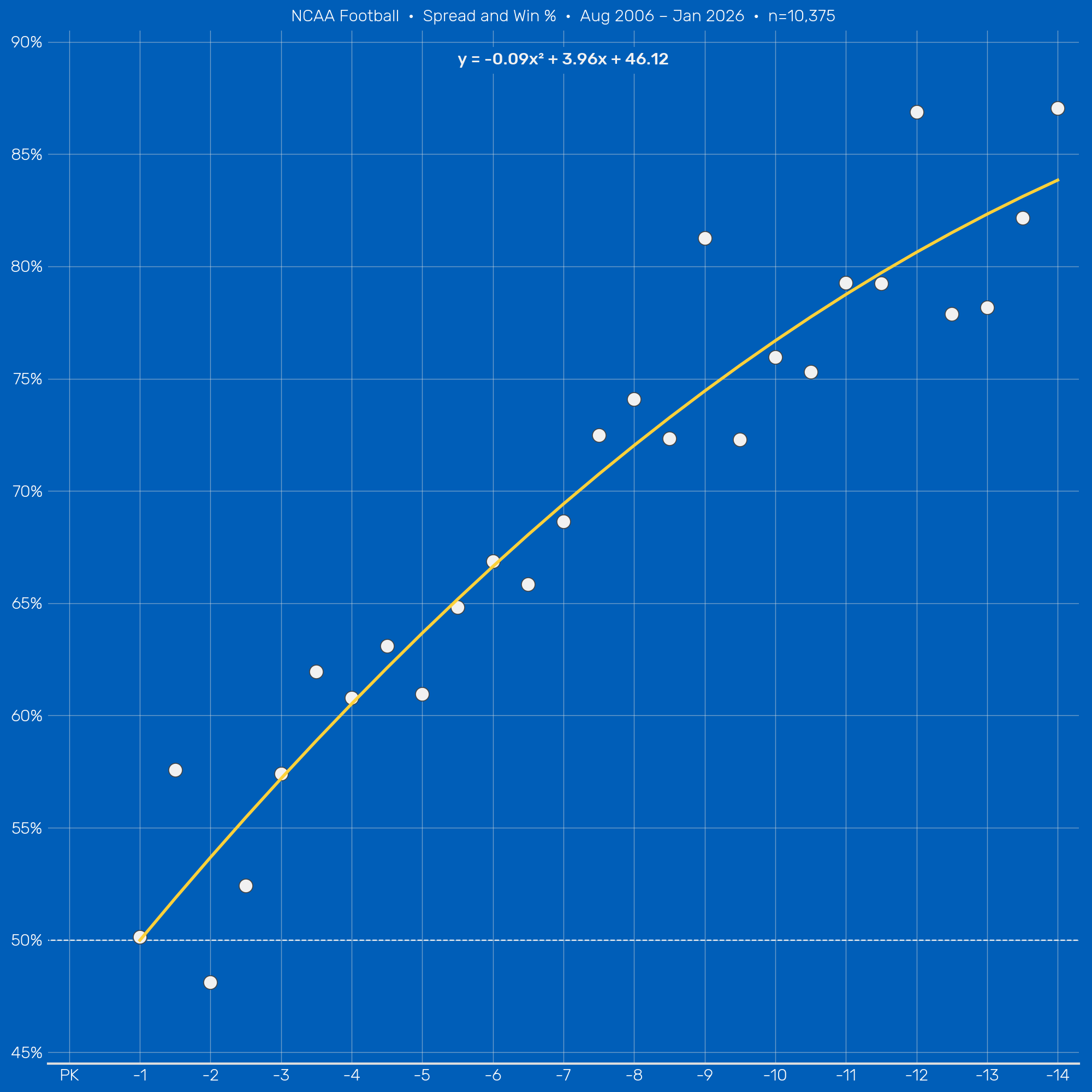
It’s very blue! To answer the original question, a 7-point favorite wins about 69% of the time in college football.
The important point is that there are diminishing returns to win% as point spread grows larger. The difference between a 3- and 4-point favorite is bigger than the difference between 13 and 14. That’s why we couldn’t do a simple linear regression and draw a straight line through the data.
Remember how we excluded pick’em spreads from the regression? According to our model there is no measurable difference between a 1-point favorite and a 1-point underdog. They’re all coinflip games. It makes sense but it’s not something I would have expected. To be honest I’d still prefer my team to be favored.
I won’t post the code but I want to show the same analysis for college basketball. I included moneyline conversions in the upper-left corner.
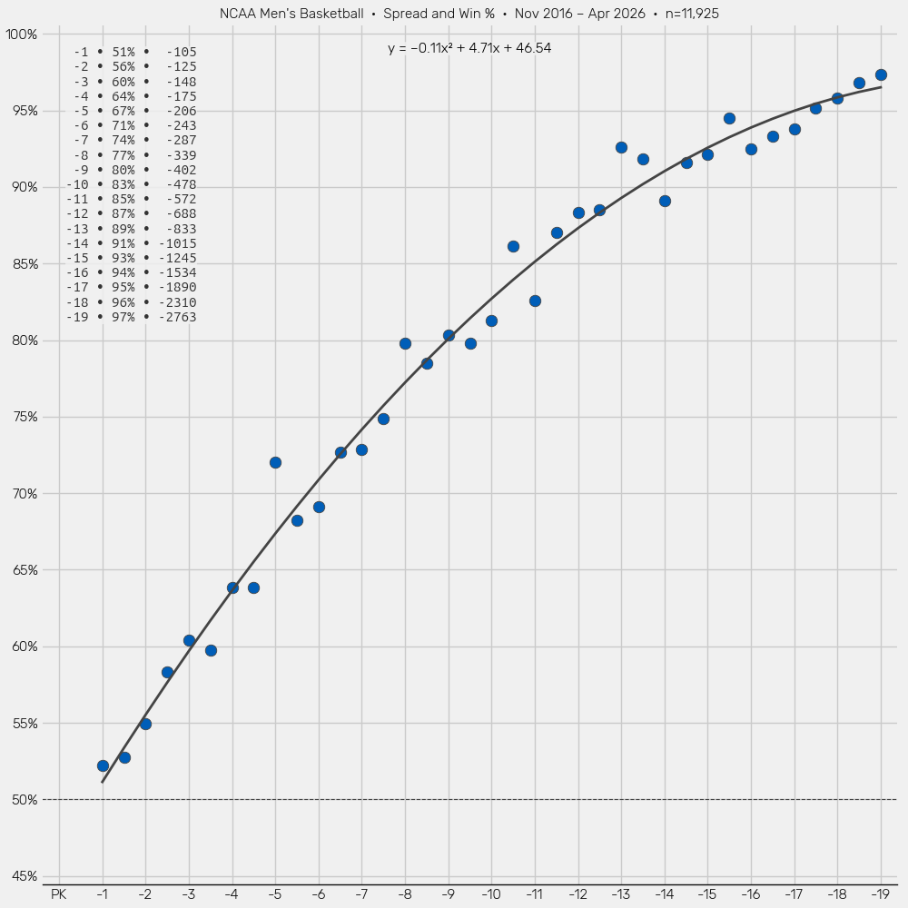
The correlation is stronger despite using roughly the same amount of data. It’s fair to say there are fewer surprises in basketball.
Full code:
import pandas as pd
from scipy.optimize import curve_fit
import matplotlib.pyplot as plt


def check_if_fav_wins(row):
    if row['whos_favored'] == "away":
        return row['score_away'] > row['score_home']
    else:
        return row['score_home'] > row['score_away']


def model(x, a, b, c):
    return a * x**2 + b * x + c


pd.set_option("display.expand_frame_repr", False)

df = pd.read_csv("cfb_spreads_1978-2025.csv", parse_dates=['date'])

df = df[df['season'] >= 2006]

df = df[(df['spread'] >= 1) & (df['spread'] <= 14)]

df['fav_wins'] = df.apply(check_if_fav_wins, axis=1)

df2 = pd.crosstab(df['spread'], df['fav_wins'])

df2['win_pct'] = df2[True] / (df2[True] + df2[False]) * 100

(coef_a, coef_b, coef_c), _ = curve_fit(f=model,
                                        xdata=df2.index,
                                        ydata=df2['win_pct'])

x_reg = df2.index.tolist()
y_reg = [coef_a * x**2 + coef_b * x + coef_c for x in x_reg]

plt.style.use("wollen_cfb.mplstyle")
fig, ax = plt.subplots()

white = "#F1F1F1"
yellow = "#FFD139"
gray = "#444"

ax.scatter(df2.index,
           df2['win_pct'],
           color=white,
           ec=gray,
           lw=0.6,
           zorder=2)

ax.plot(x_reg,
        y_reg,
        color=yellow,
        zorder=3)

ax.plot([-100, 100],
        [50, 50],
        color=white,
        linestyle="--",
        lw=0.8,
        zorder=1)

x_ticks = range(15)
y_ticks = range(45, 95, 5)

ax.set(xticks=x_ticks,
       xticklabels=[f"-{n}" if n != 0 else "PK" for n in x_ticks],
       xlim=(-0.3, 14.3),
       yticks=y_ticks,
       yticklabels=[f"{n}%" for n in y_ticks],
       ylim=(44.5, 90.5))

first_month = df['date'].min().strftime('%b %Y')
final_month = df['date'].max().strftime('%b %Y')
ax.set_title(f"NCAA Football  •  Spread and Win %  •  {first_month} – {final_month}  •  n={df.shape[0]:,}")

ax.text(x=7,
        y=89.5,
        s=f"y = {coef_a:.2f}x² + {coef_b:.2f}x + {coef_c:.2f}",
        size=11,
        weight="500",
        ha="center",
        va="top",
        bbox={"fc": "#005EB8", "ec": "None"})

plt.savefig("cfb_spread_regression.png", dpi=200)